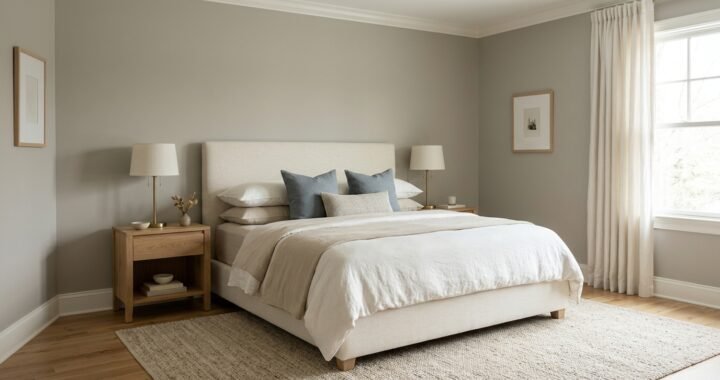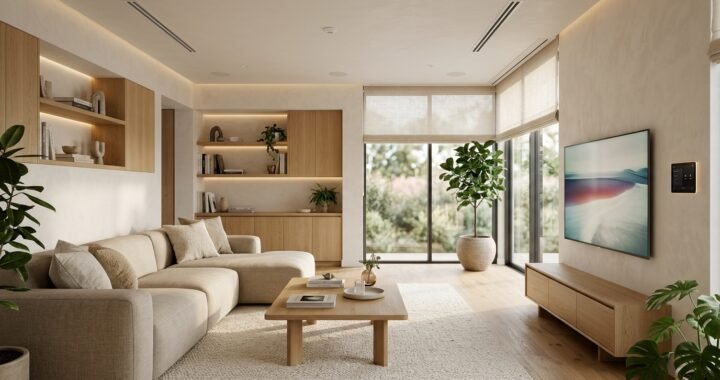

Revere Pewter is Benjamin Moore HC-172, a popular neutral paint color from the brand’s Historical Color Collection. Benjamin Moore describes it as an iconic neutral that bridges warm and cool tones, which helps explain why it can work across both traditional and modern interiors. It has an LRV of 55.05, placing it around the middle of the light-reflectance scale rather than among very pale off-whites. In practical terms, the color can read as a warm gray, gray-beige, or soft greige depending on daylight, artificial lighting, surrounding finishes, and nearby colors. Benjamin Moore also lists Ice Formations 973 as another name for the same color. The most important thing to know before using this shade is that digital photographs are not reliable enough for a final decision. Benjamin Moore itself warns that screen representations can differ from actual paint. A physical sample viewed in the intended room is therefore essential. The sections below explain the color’s depth, lighting behavior, coordinating colors, room applications, exterior potential, finish choices, and the situations where another neutral may be easier to use.
What Color Is Revere Pewter?
Revere Pewter sits between the familiar categories of gray and beige. Benjamin Moore calls it a versatile bridge between warm and cool tones, while the company’s FAQ describes HC-172 as a classic light gray with warm undertones. Those descriptions are more useful than trying to force the shade into one simple label. It does not behave like a cold blue-gray, yet it is not a traditional golden beige either. Its balanced character allows warm wood, white trim, stone, dark accents, and many muted colors to sit beside it without creating an immediate clash. The surrounding room still determines which side becomes more noticeable. Warm flooring and cream textiles may strengthen its warmer character. Cooler daylight or nearby gray materials can make the gray side more apparent. This flexibility is one reason the color has remained prominent in Benjamin Moore’s neutral palette. It is also why looking at one online photograph cannot tell a homeowner exactly how it will appear on their own walls.
Revere Pewter Has an LRV of 55.05
Benjamin Moore currently lists the Light Reflectance Value, or LRV, of Revere Pewter as 55.05. LRV is a measurement used to describe how much visible light a color reflects. The scale runs from 0 for theoretical absolute black to 100 for theoretical pure white, so a value around 55 places this shade in the middle range. That does not mean it will make every room dark, but it has noticeably more depth than pale off-whites and very light neutrals. In a room with large windows and strong daylight, the color can appear open and comfortably light while still giving the walls definition. In a dim room, the same paint can look considerably deeper. This is an important distinction for homeowners moving away from white walls. A sample that seems light on a small card may feel stronger when applied across several walls. LRV is useful for understanding relative depth, but it cannot predict undertones or compensate for poor lighting. Those qualities still need to be evaluated in the actual space.
Lighting Can Change the Way the Color Reads
Paint color is never viewed independently of light. Revere Pewter can look different from morning to evening because daylight changes in intensity and character throughout the day. A room with abundant daylight may reveal more of the color’s balanced neutral quality. Lower light can make it look richer and more grounded. Artificial bulbs can shift perception again. Warm lighting may emphasize the softer beige side, while cooler lighting can make the gray character more noticeable. The amount of paint visible also matters. A small swatch surrounded by an existing wall color is not the same visual experience as a full painted wall. Benjamin Moore advises customers that lighting affects how colors appear and recommends evaluating colors rather than relying on digital displays. Move a large sample around the room and check it beside the floor, trim, furniture, and fixed finishes. View it in morning light, afternoon light, evening light, and the artificial lighting normally used after sunset. That simple process reveals more than studying dozens of edited room photographs online.
Room Direction Can Influence the Final Appearance
Window direction is one part of the lighting picture, although it should never be treated as a rigid color rule. North-facing rooms often receive cooler indirect daylight, so Revere Pewter may appear grayer or more muted there. South-facing rooms usually receive stronger, warmer daylight for substantial periods, which can make its warmer character easier to notice. East-facing spaces change significantly as bright morning light fades later in the day. West-facing rooms often do the opposite, becoming warmer and brighter toward afternoon or evening. Trees, neighboring buildings, porches, window size, glazing, weather, and geographic location can alter these general patterns. Interior finishes matter too. A warm oak floor reflects different color into a room than cool gray tile. Instead of selecting paint from window direction alone, use direction as a clue about why a sample changes during the day. The best test is still the room itself. Observe the sample through a normal daily lighting cycle before committing to a large quantity of paint.
Living Rooms Are a Natural Place to Use This Neutral
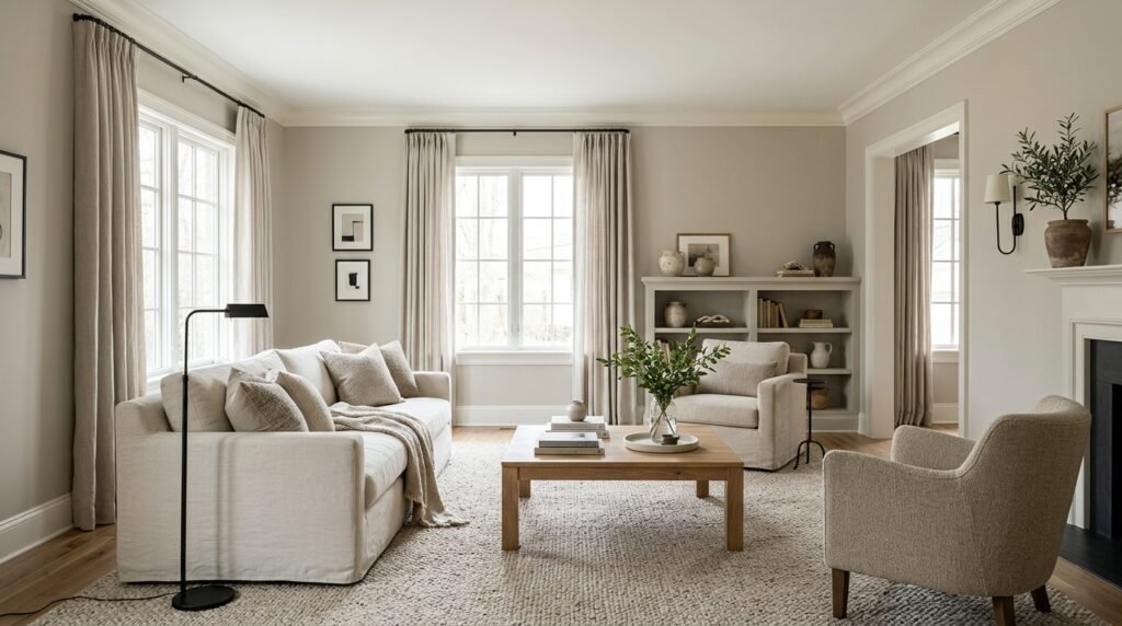
A living room often contains more colors and materials than a homeowner initially realizes. Upholstery, flooring, rugs, wood, metal, curtains, artwork, and adjoining rooms all influence the walls. Revere Pewter can be useful in this setting because its moderate depth creates a background without behaving like a stark white. It can sit comfortably beside many natural materials and provide enough contrast for light trim. In a bright living room, it may create a relaxed neutral envelope while allowing furniture and art to carry stronger colors. In a smaller or darker room, the result can feel more substantial, so lighting and furniture colors deserve extra attention. Large cream furniture can brighten the scheme, while dark wood and charcoal accents can make it moodier. The paint is especially practical where the goal is a neutral that has visible presence rather than disappearing into the background. Before painting an open-plan living area, test the color from several viewpoints because walls shared with dining rooms, halls, or kitchens may receive very different amounts of light.
Bedrooms Can Use Its Softer, More Grounded Side
Bedrooms often benefit from colors that feel settled rather than visually sharp. Revere Pewter has enough depth to define the walls while remaining neutral enough to support changing bedding and decor. Warm whites, natural linen, wood furniture, muted greens, blues, and deeper accent colors can all create different directions around it. The main consideration is light. A bedroom with limited daylight may make HC-172 look stronger than expected, particularly when dark furniture and heavy window treatments are also present. That is not necessarily a problem if a cozy effect is desired. For a lighter result, brighter bedding, lighter curtains, reflective surfaces, and carefully planned artificial lighting can balance the walls. A bedroom also provides a useful example of why undertones should be judged beside permanent finishes. Carpet, wood flooring, upholstered headboards, and built-in wardrobes can alter how the wall color appears. Test the sample beside those materials rather than on an isolated white board viewed outside the room.
Kitchens Need Careful Coordination With Fixed Finishes
Kitchen paint decisions should begin with the elements that are expensive or difficult to replace. Cabinets, countertops, backsplash tile, flooring, and large appliances usually matter more than a preferred wall color. Revere Pewter can work in kitchens, but its success depends on how its balanced warm-gray character relates to those fixed surfaces. Warm wood cabinetry can bring out its softer side. White cabinets can create a cleaner contrast, although the particular white matters because whites have undertones too. Cool stone or tile may pull the paint in another direction. Place a sample beside each major finish rather than judging it from the center of the room. If the kitchen is open to a living or dining area, examine the color from both spaces. A neutral that looks balanced beside the kitchen cabinets may appear different beside the living-room flooring. Cabinet painting also requires a coating and preparation process suited to cabinetry; choosing HC-172 specifies a color, not the complete coating system or preparation method needed for every surface.
Bathrooms Can Make the Color Look Deeper
Bathrooms frequently have less natural light than living spaces, and some have no windows at all. Under those conditions, Revere Pewter may appear deeper than it does in bright promotional photographs. Mirrors, tile, countertops, cabinetry, and artificial lighting also influence its appearance. A bathroom with light stone, white fixtures, and strong lighting can give the shade enough visual contrast to feel balanced. A room already filled with medium or dark finishes may become more enclosed if another mid-depth color is added to every wall. Sampling is therefore particularly useful. Bathrooms also require more than a good color choice. Moisture, ventilation, surface condition, and the selected paint product and sheen affect long-term performance. Benjamin Moore offers products intended for different applications, so follow the instructions for the specific coating chosen rather than assuming the color name determines performance. The goal is to combine a suitable bathroom coating with a color that works under the room’s real lighting and alongside its permanent finishes.
White Dove Is an Official Coordinating Color
Homeowners often search for the right white to pair with Revere Pewter, and Benjamin Moore provides useful starting points. The official HC-172 color page lists White Dove OC-17 among its expert-picked coordinating colors. Benjamin Moore’s FAQ also suggests White Dove in a soothing three-color scheme with Van Courtland Blue HC-145. This makes White Dove a sensible color to sample for trim, cabinetry, or other light elements, but an official pairing is not a guarantee that it will be ideal in every house. Existing floors, stone, countertops, natural light, and adjacent rooms can change how two colors interact. Benjamin Moore also recommends Ballet White OC-9 or Cloud Cover OC-25 for a soft neutral scheme. These options demonstrate that HC-172 does not require one mandatory trim color. Compare possible whites directly beside the wall sample and fixed finishes. A white that appears clean in one house may look warmer or cooler in another. Sampling both colors together is more reliable than selecting a trim white from its name or an online photograph.
Darker Colors Can Give the Neutral More Definition
A mid-range neutral often becomes more interesting when paired with deliberate contrast. Benjamin Moore’s official Revere Pewter page lists Chelsea Gray HC-168 as a coordinating color, while the company’s FAQ suggests richer choices such as Hunter Green 2041-10 and Dinner Party AF-300 for bolder schemes. These pairings show how HC-172 can act as a quieter background while deeper colors create focal points. Dark accents may work on furniture, cabinetry, interior doors, an island, textiles, or selected architectural details depending on the room. The exact balance matters. Too many competing dark elements can make a small room visually heavy, while one strong accent can create useful structure. Natural wood can serve a similar role without adding another paint color. Before selecting a dark companion, compare samples under the room’s actual light. The objective is not simply to create contrast. The colors should also relate to the flooring, furniture, stone, and other materials that already occupy the space.
Muted Blues and Greens Can Build a Calmer Palette
Benjamin Moore specifically recommends Van Courtland Blue HC-145 with Revere Pewter and White Dove as a soothing three-color combination. The company also identifies Hunter Green as a bolder companion. These examples are useful because they demonstrate how a balanced neutral can support color without making the room feel overly busy. Muted blue can introduce cool contrast, while green can connect easily with wood, plants, stone, and other natural materials. The amount of accent color determines the effect. A blue chair or green textile is very different from painting a large bank of cabinetry. Start with the largest permanent surfaces and then decide how much color the room can support. Artwork and fabrics are also lower-commitment ways to test a palette. If a nearby room already contains blue or green, repeating a related tone can help create continuity through the home. Exact paint pairings should still be sampled because neighboring colors can change the way HC-172 itself is perceived.
Wood Tones Can Shift the Overall Mood
Wood is rarely a truly neutral background. Oak, walnut, maple, pine, and stained finishes contain visible yellow, orange, red, brown, gray, or other tones that interact with wall paint. Revere Pewter can sit comfortably beside many wood finishes because it bridges warm and cool color families, but the result changes according to the wood. Honey-toned floors may emphasize warmth. Dark walnut can create stronger contrast and make the walls seem lighter by comparison. Pale or desaturated wood can support a softer contemporary palette. Redder woods require closer testing because surrounding colors can make subtle undertones more noticeable. The same principle applies to wood-look flooring and cabinetry. Bring the paint sample directly to the floor or cabinet rather than comparing separate photographs. If several wood tones share one open space, look at the full combination before adding another strong finish. A successful neutral should help connect the room’s major materials instead of creating a new conflict between them.
Revere Pewter Can Work in Traditional and Modern Interiors
Benjamin Moore describes Revere Pewter and Edgecomb Gray HC-173 as versatile neutrals that complement both traditional and modern styles. That flexibility is useful because a paint color does not belong to only one decorating era. In a traditional room, HC-172 can sit behind detailed trim, classic furniture, warm woods, patterned textiles, and antique pieces. In a more contemporary space, it can provide a restrained wall color beside simple furniture, black accents, pale wood, stone, and clean architectural lines. Transitional interiors can use it to connect old and new elements. The styling around the paint determines much of its personality. This is why calling it dated or modern without context is not especially useful. A neutral wall color does not establish the entire style of a room. Furniture shape, lighting, flooring, textiles, hardware, art, and architectural details have greater influence. If the existing home already contains several permanent traditional or contemporary elements, the paint can act as a bridge rather than forcing a complete redesign.
Revere Pewter Is Also Used on Exteriors
HC-172 is not limited to interior walls. Benjamin Moore currently includes Revere Pewter among its recommended exterior house colors and presents an exterior palette using it for the main body, Swiss Coffee OC-45 for trim, and Copley Gray HC-104 as an accent. This official example confirms that the color can be considered for suitable exterior applications when used with an appropriate exterior paint product. Exterior daylight is much stronger than typical indoor illumination, so a color may appear lighter outdoors than expected from an interior sample. Roof color, brick, stone, landscaping, neighboring surfaces, and trim all influence the final result. Test a large exterior sample on more than one side of the house because orientation and shade can change its appearance. The substrate also matters. Wood, masonry, previously painted siding, and other materials may require different preparation and coating systems. Follow the instructions for the selected Benjamin Moore exterior product and address damaged surfaces before painting. Color choice cannot compensate for poor preparation.
Revere Pewter and Edgecomb Gray Are Not the Same Color
Benjamin Moore places both Revere Pewter HC-172 and Edgecomb Gray HC-173 among its popular Historical Collection neutrals, but the company describes Edgecomb Gray as slightly lighter and warmer. This distinction is useful for homeowners who like HC-172 but find it too deep or too gray in their particular room. Edgecomb Gray may be worth sampling beside it rather than trying to judge the difference from separate web photographs. The comparison also illustrates a broader paint-selection lesson: small differences between related neutrals can become much more noticeable across an entire wall. A room with weak daylight may benefit from the lighter option, while a bright room may comfortably handle the extra depth of HC-172. Existing materials can reverse expectations by making one color appear warmer or cooler than it does on a white sample card. Test both on the same wall and observe them under identical conditions. The better color is the one that relates most naturally to the actual room, not the one with greater online popularity.
Sampling Is More Reliable Than Choosing From a Screen
Benjamin Moore explicitly states that on-screen and printer representations may vary from actual paint colors. That warning is particularly important for complex neutrals such as Revere Pewter because subtle shifts between gray, beige, and warmth are difficult to judge accurately through a display. Screen brightness, device settings, photography, editing, room lighting, and surrounding colors can all change the image. Start with an official color chip or sample, then evaluate a larger area before buying paint for an entire room. Move the sample to different walls if possible. A wall facing a window may behave differently from one beside it. Compare the sample with trim, flooring, cabinetry, stone, textiles, and furniture. Check it after sunset under the lights normally used in the room. Do not judge the color for only a few minutes. Seeing it through a normal day provides a more realistic picture of its range. Sampling requires extra time, but repainting a room because the undertone was unexpected requires much more.
The Paint Sheen Changes the Finished Surface
Choosing HC-172 identifies the color, but the final appearance also depends on the paint product and sheen. Flat or matte surfaces reflect light differently from eggshell, satin, pearl, semi-gloss, or higher-sheen finishes. Sheen can affect how strongly light catches the wall and how visible surface imperfections become. The right choice depends on the substrate, room, expected wear, cleaning needs, and the specific paint product being used. Walls, trim, doors, cabinetry, bathrooms, and exteriors do not necessarily need the same coating or finish. Benjamin Moore offers the Historical Collection colors across multiple premium paint products, including products intended for different applications. Follow the technical instructions for the selected product rather than relying on a universal rule based only on color. Existing wall condition also matters. Higher sheen can reveal uneven repairs or texture more clearly. Proper preparation, compatible primers where required, correct application, and recommended drying or recoat conditions are part of achieving a professional result.
Surface Preparation Matters as Much as Color Selection
Even a well-chosen Revere Pewter scheme can look poor on a damaged or badly prepared surface. Before painting, inspect walls or exterior substrates for peeling coatings, holes, cracks, stains, dirt, grease, moisture problems, or other defects. The exact preparation depends on the surface and selected coating. Cleaning, repairing, sanding, priming, and addressing underlying moisture or adhesion problems may be required. Manufacturer instructions should guide the process because different paint systems and substrates have different needs. Do not use a new coat of paint to hide an active leak, persistent dampness, failing substrate, or structural problem. Those issues should be corrected first. Protect floors, furniture, hardware, and adjacent surfaces before work begins, and maintain suitable ventilation during interior painting. If the project involves difficult exterior access, hazardous existing materials, extensive coating failure, or conditions outside normal DIY experience, professional help may be appropriate. Good preparation is less exciting than choosing a color, but it has a major effect on the finished surface and durability.
Common Mistakes Can Make This Neutral Harder to Use
One common mistake is selecting Revere Pewter because it looked perfect in another person’s house. Their windows, floors, furniture, lighting, camera settings, and surrounding colors are not the same as yours. Another mistake is judging the shade from a tiny digital image or a small sample viewed for only a few minutes. Some homeowners also choose trim after the walls are finished, only to discover that the existing white has an undertone that creates an unwanted contrast. Test wall and trim colors together. Do the same with flooring, countertops, tile, and cabinetry. Another problem is assuming a popular neutral will automatically brighten a dark room. With an LRV of 55.05, HC-172 has real depth and will not behave like a high-LRV off-white. Finally, avoid choosing the color before deciding whether the room actually needs a warmer, cooler, lighter, or deeper neutral. Popularity is useful for finding options, but the room should make the final decision.
Is Revere Pewter Still a Good Choice?
Benjamin Moore continues to feature Revere Pewter prominently. It appears on the brand’s current color page, neutral-paint resources, exterior inspiration, and Historical Color Collection material. In 2026, Benjamin Moore marked the 50th anniversary of the Historical Collection and identified HC-172 among the collection’s enduring popular colors. That ongoing presence is more useful than trying to decide whether a neutral is “in” or “out” according to a short trend cycle. The better question is whether it works with the particular home. Its middle-range depth can be an advantage for someone who wants more substance than an off-white. Its warm-gray balance can also help connect traditional and modern materials. On the other hand, a dark room that needs maximum brightness may suit a lighter neutral better. A room filled with finishes that make HC-172 appear unexpectedly muddy or greenish may also need another option. Paint should be chosen for the space, not because a color is famous.
How to Decide if Revere Pewter Is Right for Your Home
A practical decision starts with the room rather than the paint card. First identify the fixed materials: flooring, countertops, cabinets, tile, stone, fireplace finishes, and large furniture that will remain. Next, consider how much natural light enters and when the room is normally used. Place a large Revere Pewter sample beside those finishes and view it on different walls. Compare at least one lighter or warmer alternative if HC-172 seems too strong. If trim will also be painted, sample the proposed white beside it rather than making two separate decisions. Observe everything under daytime and nighttime lighting. For an exterior, compare the sample with roofing, masonry, trim, and landscaping in direct sun and shade. Once the color relationship works, select a Benjamin Moore paint product and sheen appropriate for the surface and room. This process may take longer than choosing from a popular-colors list, but it answers the question that matters: how the color behaves in the specific home where it will actually be used.
FAQs
What color is Revere Pewter?
Revere Pewter HC-172 is a Benjamin Moore neutral that bridges warm and cool tones. Benjamin Moore also describes it as a classic light gray with warm undertones. In real rooms, it can read as gray, warm gray, or greige depending on lighting and surrounding materials.
What is the LRV of Revere Pewter HC-172?
Benjamin Moore lists its LRV as 55.05. That gives the color noticeable depth compared with pale off-whites while still allowing it to reflect a moderate amount of light. Actual appearance depends strongly on the room’s lighting and surrounding finishes.
What white goes well with HC-172?
Benjamin Moore lists White Dove OC-17 as an official coordinating color and also recommends Ballet White OC-9 and Cloud Cover OC-25 in soft neutral combinations. Sample the chosen white beside HC-172 and the room’s fixed materials because whites can also show different undertones.
Does HC-172 look green?
Some homeowners may perceive a subtle greenish cast under certain combinations of light and surrounding finishes, but Benjamin Moore’s official description focuses on its ability to bridge warm and cool tones. If green is a concern, a physical sample in the actual room is the safest way to judge it.
Can HC-172 be used on a house exterior?
Yes. Benjamin Moore currently features HC-172 as an exterior body color and pairs it with Swiss Coffee OC-45 trim and Copley Gray HC-104 accents. Use an appropriate exterior coating, follow product instructions, and test the color outside because strong daylight changes its appearance.
Is Revere Pewter darker than Edgecomb Gray?
Benjamin Moore describes Edgecomb Gray HC-173 as slightly lighter and warmer than HC-172. Homeowners deciding between them should sample both in the same room because the difference can become much clearer across a large wall than it appears on a screen.
Conclusion
Revere Pewter remains a useful Benjamin Moore neutral because it occupies the space between obviously warm beige and distinctly cool gray. HC-172 belongs to the Historical Color Collection, has an LRV of 55.05, and continues to be presented by Benjamin Moore for both interior and exterior color schemes. Its versatility does not mean it looks identical everywhere. Daylight, artificial lighting, wood, flooring, stone, trim, furniture, and nearby colors can make the shade appear warmer, grayer, deeper, or occasionally slightly greenish to the eye. Official coordinating options such as White Dove, Chelsea Gray, Van Courtland Blue, and other Benjamin Moore suggestions provide useful starting points, but physical sampling should make the final decision. Test Revere Pewter beside the materials that will remain in the room, observe it throughout the day, and choose the coating and sheen according to the actual surface. That careful approach is more dependable than selecting any neutral from photographs alone.