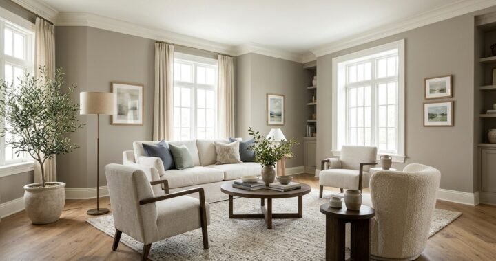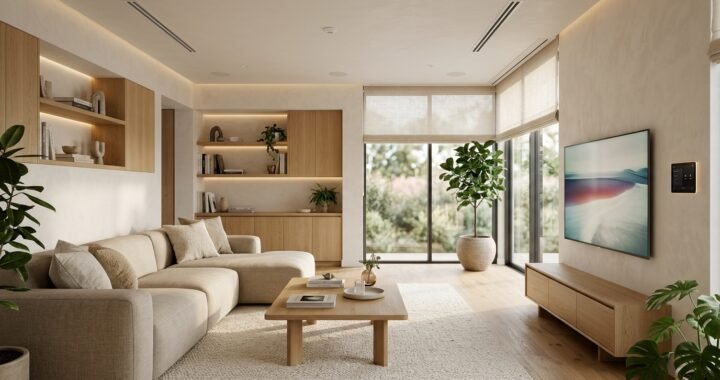
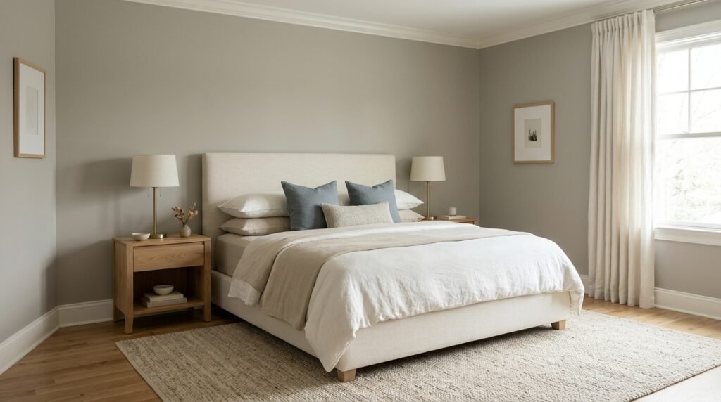
BM Revere Pewter is Benjamin Moore Revere Pewter HC-172, a popular neutral from the company’s Historical Color Collection. Benjamin Moore describes the color as an iconic neutral that bridges warm and cool tones, and its official light reflectance value is 55.05. That puts it in a useful middle range: it has more depth than a pale off-white but still reflects a meaningful amount of light. The color is often described as a warm gray or greige because it can sit between gray and beige, although lighting, flooring, furniture, and nearby colors can change how it appears. It may look warmer in one room, grayer in another, and occasionally show a subtle green influence under certain conditions. Benjamin Moore currently lists Revere Pewter among its popular neutral colors and continues to feature it for both interior and exterior applications. The most reliable way to decide whether it belongs in a home is to test an actual sample in the intended room rather than choosing from an online image.
What Color Is BM Revere Pewter?
BM Revere Pewter is officially Revere Pewter HC-172. Benjamin Moore describes it as a neutral that provides a bridge between warm and cool tones. The company’s Canadian FAQ more specifically calls Revere Pewter a warm gray, which helps explain why it does not behave like a cold blue-gray. In real interiors, people often place it in the greige family because it can show both gray and warmer beige-like qualities. The balance is what makes the color flexible, but it also makes sampling important. Warm wood floors can bring forward its softer, warmer character. Cool daylight or nearby cool finishes can make the gray side more noticeable. Green landscaping outside a window, artificial lighting, upholstery, stone, and cabinetry can also influence perception. It is therefore more accurate to think of the color as a complex neutral than as a fixed beige or simple gray. Benjamin Moore also lists Ice Formations 973 as another name for the same color.
Revere Pewter HC-172 Has an LRV of 55.05
Light reflectance value, usually shortened to LRV, indicates how much visible light a paint color reflects on a scale from 0 to 100. Benjamin Moore gives BM Revere Pewter an LRV of 55.05. That number helps explain why the color has noticeable body without appearing extremely dark. It is not a very pale neutral that nearly disappears against white trim, but it is also far from charcoal territory. In a bright room with large windows, the color may look relatively light and soft. In a room with limited natural light, the same paint can appear deeper and more grounded. LRV does not predict the exact color a person will see because it measures reflectance rather than undertone or room conditions. It is best used as one part of the decision. Window direction, artificial bulbs, floor color, surrounding surfaces, and furniture all affect the final result. A homeowner wanting a very bright, airy wall may prefer to compare HC-172 with lighter alternatives before committing.
Lighting Can Change the Way the Color Appears
Neutral paint is especially sensitive to its surroundings because subtle shifts become more noticeable across a large wall. BM Revere Pewter can look different from morning to evening as natural and artificial light change. A room with strong daylight may reveal more of its gray character, while warm evening lamps can make the walls appear softer and warmer. North-facing rooms in the Northern Hemisphere often receive cooler indirect light, which can make many neutrals look cooler or slightly more muted. South-facing rooms usually receive stronger and often warmer daylight for longer periods, though the exact effect depends on windows, climate, landscaping, and season. East- and west-facing rooms can change significantly through the day because direct sunlight shifts from one side of the home to the other. These patterns are useful starting points, not guarantees. Benjamin Moore itself warns that screen and printer representations can differ from actual paint colors. Testing the real color on the actual site remains more reliable than judging a digital swatch.
Undertones Depend on the Room Around the Paint
Paint undertones are often discussed as if they are fixed switches that appear the same everywhere. Real rooms are more complicated. BM Revere Pewter is officially positioned between warm and cool tones, so surrounding materials can pull its appearance in different directions. Warm oak, cream textiles, tan stone, and beige upholstery can emphasize its warm side. Cooler whites, blue furnishings, and cooler daylight can make the gray component easier to notice. Some combinations may also make a slight green cast more visible. This does not mean the paint suddenly changes formula. Human color perception is affected by adjacent colors and lighting. Fixed finishes deserve particular attention because flooring, countertops, tile, stone, brick, and large cabinetry are harder to change than a throw pillow. Before painting an entire room, place a sample near these materials and inspect it at different times. If the color repeatedly clashes with an expensive fixed finish, choosing another neutral is usually wiser than trying to force the palette to work through accessories.
White Dove Is an Official Coordinating Color
White trim can strongly affect how a neutral wall color is perceived. Benjamin Moore lists White Dove OC-17 among its expert-picked coordinating colors for Revere Pewter. It also lists Chelsea Gray HC-168 in the same combination, while another official pairing includes Sparrow AF-720 and Fog Mist OC-31. Benjamin Moore’s FAQ further recommends White Dove with Van Courtland Blue HC-145 for a soothing three-color scheme. This gives homeowners a useful official starting point rather than relying entirely on random online palettes. BM Revere Pewter does not require White Dove, however. Existing trim may already be painted another white that works well with the room. The key is to compare the two colors physically. A very cool or stark white can create a different contrast than a softer white. If trim, doors, ceilings, and cabinetry are already painted, sample HC-172 directly beside those surfaces before deciding whether the relationship looks intentional.
Soft Neutrals Can Create a Quiet Palette
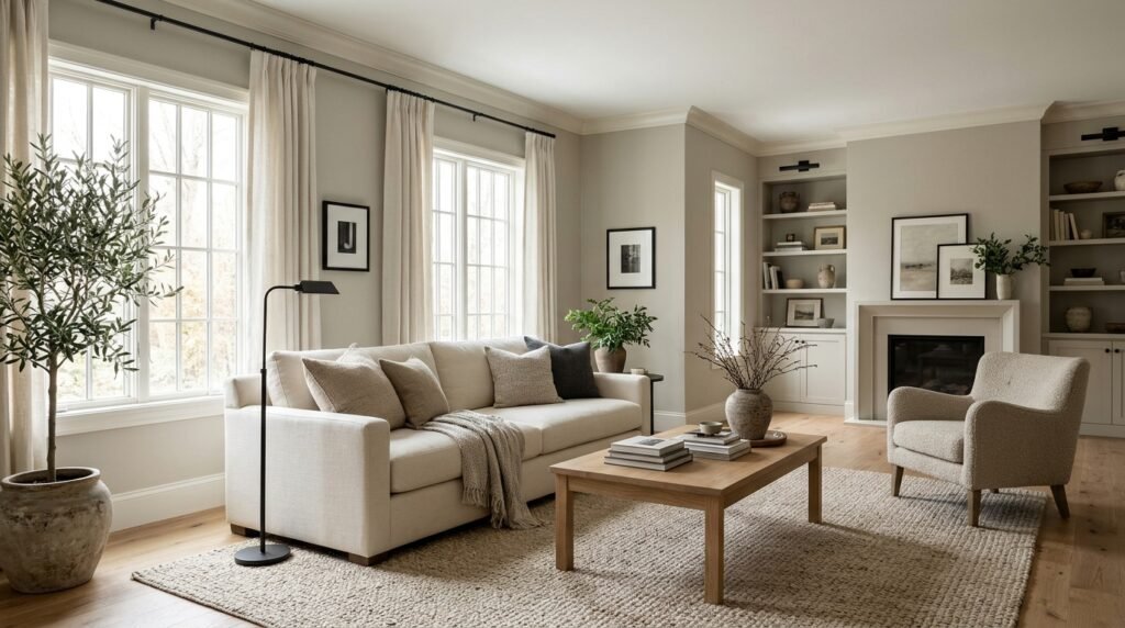
A room does not need strong contrast to keep Revere Pewter interesting. Benjamin Moore recommends Ballet White OC-9 and Cloud Cover OC-25 as options for a soft neutral scheme with the color. These pairings can be useful when the goal is a calm interior with gentle transitions rather than dramatic walls and trim. BM Revere Pewter can act as the deeper neutral while lighter surfaces keep the palette from feeling flat. Texture then becomes more important. Linen, wool, woven materials, natural wood, matte ceramics, stone, and subtle patterns can add depth without introducing many competing colors. The approach can work particularly well in bedrooms and relaxed living areas. Still, a neutral palette should be evaluated under actual room lighting. Two colors that appear distinct on separate digital swatches may look closer together on a dim wall. Conversely, a lighter trim can appear much brighter next to HC-172 than expected. Physical samples help establish whether the amount of contrast feels right.
Blues and Greens Can Add Controlled Color
Muted blues and greens can give a warm gray neutral more definition without overwhelming the room. Benjamin Moore specifically recommends Van Courtland Blue HC-145 with Revere Pewter and White Dove for a soothing palette. The company also suggests Hunter Green 2041-10 as a bolder companion when stronger contrast is wanted. These official combinations demonstrate that BM Revere Pewter does not need to stay inside a beige-and-gray palette. A muted blue can work through cabinetry, an accent wall, textiles, or furniture, while deep green can create stronger visual weight. The amount matters. A small green chair produces a different effect from a full wall of dark green. Existing materials should also guide the choice. A room with warm wood and cream upholstery may handle a cool accent differently from a room with gray stone and black metal. Use paint chips and material samples together rather than selecting each finish independently.
Darker Colors Give the Neutral More Definition
Deeper colors can keep a Revere Pewter scheme from appearing too soft. Benjamin Moore lists Chelsea Gray HC-168 as an official coordinating color, and its broader recommendations include bold options such as Dinner Party AF-300 and Hunter Green 2041-10. BM Revere Pewter can therefore serve as a quieter backdrop for dark doors, cabinetry, furniture, or accent areas. Black and charcoal details can also create visual structure, although those combinations should be judged in the context of the room rather than treated as official pairings unless the specific colors are recommended by the manufacturer. Contrast works best when it has a purpose. Dark hardware may connect with a fireplace surround, for example, while a deep painted cabinet can become a focal point. Repeating a dark accent in a few controlled places often feels more cohesive than adding unrelated dark objects throughout the room. In small or poorly lit spaces, large areas of deep color can absorb substantial light, so sampling remains useful.
Wood Tones Can Shift the Overall Mood
Wood flooring and furniture occupy large visual areas, which makes them important partners for BM Revere Pewter. Warm oak, medium walnut, reddish wood, pale natural timber, and dark-stained flooring can each change how the wall color is perceived. Warm woods may emphasize the softer side of the paint, while some gray-washed or cool-toned flooring can make the wall look warmer by comparison. Red or orange wood tones deserve special testing because their warmth can strongly affect nearby neutrals. There is no universal wood species that must be used with HC-172. The finish matters as much as the species itself. A natural oak floor and a heavily stained oak floor may create completely different palettes. If the flooring is permanent, use it as an anchor rather than choosing wall paint in isolation. Place a large sample beside the floor, baseboard, and major furniture. Check the combination in both daylight and artificial light before painting the full room.
Living Rooms Are a Natural Place to Use HC-172
Living rooms often combine several materials, which is where a balanced neutral can be useful. BM Revere Pewter can provide a background for wood furniture, upholstery, rugs, artwork, stone, metal, and accent colors without requiring every element to match. Its LRV of 55.05 gives it enough depth to create separation from many lighter trims while remaining much lighter than dramatic charcoal shades. The room’s exposure still determines the result. A bright living room may make the color appear open and soft, while a darker interior room can reveal more depth. Before choosing it for an open-concept space, consider all connected areas. Wall colors can be seen beside kitchen cabinets, counters, dining furniture, flooring, and hallway finishes at the same time. A neutral that works beautifully beside the sofa but clashes with a stone countertop will not feel cohesive across the larger space. Testing from several viewing angles helps identify these conflicts before painting begins.
Bedrooms Can Bring Out Its Softer Character
Bedrooms often benefit from colors that feel settled rather than visually demanding. BM Revere Pewter can provide that grounded effect, particularly when combined with soft whites, natural fabrics, wood, and restrained accent colors. The exact appearance will depend on how much daylight enters the room and which artificial lights are used at night. A bedroom that receives little natural light may make HC-172 feel deeper than expected. That is not automatically a problem; some people prefer a more enveloping bedroom. Others want the brightest possible walls and may be happier with a lighter neutral. Bedding is another major influence because a large duvet or upholstered headboard can sit directly against the painted wall. Compare the sample with those fabrics rather than selecting the paint from an empty room. If a room contains several different warm and cool neutrals, HC-172 can sometimes connect them, but physical sampling is the only reliable way to confirm the relationship.
Kitchens Require Careful Coordination With Fixed Finishes
Kitchens contain many permanent surfaces, so choosing wall paint only from an online photograph is risky. Countertops, backsplash tile, cabinets, flooring, appliances, and hardware all influence BM Revere Pewter. A stone countertop can contain several undertones that become more visible beside a large painted wall. Cabinet color matters even more because the two finishes may meet directly. White cabinets can create clean contrast, while wood cabinetry can make the room warmer. If the paint is being considered for cabinets themselves, the project involves more than selecting a color. Cabinet surfaces need suitable preparation and an appropriate coating system for their material and expected wear. Revere Pewter HC-172 is a color specification, not a single universal paint product or sheen. Benjamin Moore offers the color across multiple premium paint products in its Historical Collection. Choose the coating and finish according to the surface and manufacturer guidance rather than assuming the same wall product should be used everywhere.
Bathrooms Can Make the Color Look Different
Bathrooms combine artificial lighting, mirrors, tile, stone, cabinetry, and often limited windows. Those conditions can change how BM Revere Pewter appears. A small bathroom without much daylight may make the color look more saturated or deeper than it does in a bright living room. Large mirrors can reflect both the painted walls and surrounding finishes, increasing the visual influence of nearby tile or cabinetry. Warm vanity lighting may also shift the overall impression. If the bathroom contains fixed beige, gray, green, or cream materials, place a sample beside each one. Color is only one part of a bathroom paint decision. Bathrooms can experience moisture and frequent cleaning, so the coating should be selected for the environment and surface. Benjamin Moore includes specialized products such as Aura Bath & Spa within its current premium range, but the correct product should be chosen according to project needs and current manufacturer directions.
Revere Pewter Can Work in Traditional and Modern Interiors
Benjamin Moore’s Historical Collection is celebrating its 50th anniversary in 2026, and the company identifies Revere Pewter HC-172 among the collection’s most popular colors. Benjamin Moore also says the shade works with both traditional and modern styles. That versatility is useful because the wall color does not impose a strong decorative theme by itself. In a traditional room, BM Revere Pewter can sit beside detailed trim, wood furniture, classic fabrics, and historical-inspired colors. In a more contemporary room, it can provide a quiet background for simple furniture, black accents, pale woods, stone, and cleaner lines. The difference comes from the materials and contrast around it. Paint alone does not make a room traditional or modern. This also explains why photos of HC-172 can look surprisingly different from one another. The same color can support several design directions while still reacting to different light, flooring, trim, and furnishings.
BM Revere Pewter and Edgecomb Gray Are Different
Revere Pewter HC-172 and Edgecomb Gray HC-173 sit next to each other numerically in Benjamin Moore’s Historical Collection, but they should not be treated as interchangeable. Benjamin Moore describes Edgecomb Gray as slightly lighter and warmer than Revere Pewter. This distinction can matter in a room where HC-172 feels a little too deep or gray. BM Revere Pewter provides more visual weight, while Edgecomb Gray may produce a softer and lighter impression. Still, the better choice cannot be made from descriptions alone. A room with strong natural light may support the additional depth of HC-172 beautifully. A darker room might benefit from comparing both colors before deciding. Existing finishes can also favor one over the other. Sample the two paints on separate boards or test areas and move them around the room. Looking at them side by side throughout the day reveals differences that small digital swatches may hide.
Revere Pewter Can Also Be Used on Exteriors
HC-172 is not limited to interior walls. Benjamin Moore currently features Revere Pewter in its exterior inspiration and Favorites materials. One official exterior combination uses Revere Pewter HC-172 for the body, Swiss Coffee OC-45 for trim, and Copley Gray HC-104 as an accent. Benjamin Moore’s Favorites palette also shows the shade as an exterior siding color. BM Revere Pewter can look substantially lighter outdoors because exterior surfaces receive much stronger daylight than most interior walls. Roof color, brick, stone, landscaping, neighboring surfaces, and orientation also influence the result. A small interior paint chip is therefore not enough for an exterior decision. Test a larger sample on the actual building and inspect it from a normal viewing distance at different times of day. The coating must also be suitable for the exterior substrate and climate conditions. Follow current product preparation and application instructions rather than assuming interior painting methods apply outside.
Paint Sheen Changes the Finished Surface
The color code identifies the hue, but sheen influences how a painted surface looks and performs. BM Revere Pewter can be produced in different Benjamin Moore paint products and finishes, depending on the intended surface. Benjamin Moore currently offers the color in products with finishes including matte, eggshell, satin, and semi-gloss in relevant product lines. Lower-sheen wall finishes generally create less obvious reflection, while higher sheens can highlight surface texture and respond more strongly to direct light. Trim, doors, cabinetry, walls, and ceilings may have different performance needs, so one sheen should not automatically be used throughout the house. Surface condition matters as well. A wall with patches or uneven texture can reveal imperfections differently under a more reflective finish. Choose the product and sheen based on the room, substrate, cleaning needs, desired appearance, and current manufacturer instructions. The same HC-172 formula can appear slightly different to the eye as lighting reflects from different surface finishes.
Surface Preparation Still Determines Paint Quality
A beautiful color cannot compensate for poor preparation. Before applying BM Revere Pewter, inspect walls for loose paint, damage, stains, dust, grease, uneven repairs, or other conditions that may affect the coating. Preparation requirements depend on the substrate and selected paint product, so the manufacturer’s current label and technical guidance should control the process. Previously painted walls in sound condition may require a different approach from bare drywall, glossy surfaces, repaired patches, wood, masonry, or exterior siding. Primer needs also vary. Do not assume every project requires the same primer or that paint-and-primer marketing eliminates all preparation. Repairs should be allowed to reach the appropriate condition before coating. Protect floors, trim, furniture, and adjacent surfaces, and provide suitable ventilation during the project. If the substrate contains unknown older coatings, moisture damage, mold, structural deterioration, or another condition beyond routine painting, address the underlying issue rather than covering it with a new color.
Sampling Is More Reliable Than Choosing From a Screen
Benjamin Moore explicitly warns that on-screen and printed representations may differ from actual paint colors. That warning is especially relevant for BM Revere Pewter because small shifts in a balanced neutral can determine whether it works with a room’s fixed finishes. A phone display can change brightness and color temperature. Photography may also be edited or captured under lighting unlike the intended room. Start with a physical color chip, then use an actual paint sample when the decision matters. A movable sample board can be useful because it can be viewed near flooring, cabinets, trim, furniture, and different walls without painting several separate patches. Inspect the sample in morning light, afternoon conditions, and the artificial lighting normally used at night. Do not compare colors only while holding them horizontally under a store light. Paint is usually seen vertically on a wall, surrounded by the materials already present in the home.
Common Mistakes Can Make the Color Harder to Use
The most common mistake is choosing HC-172 because it looked attractive in someone else’s room. Their flooring, windows, bulbs, furnishings, camera settings, and exposure may be completely different. Another mistake is assuming BM Revere Pewter is always beige, always gray, or always green. Benjamin Moore’s own description emphasizes its position between warm and cool tones. Ignoring fixed finishes is another frequent problem. A wall color should be tested against flooring, counters, tile, stone, cabinetry, and trim before a large purchase. People also sometimes select a paint color and coating as if they were the same decision. HC-172 specifies the color; the correct paint product and sheen depend on the surface and application. Finally, avoid evaluating a tiny wet patch and making an immediate decision. Use a representative sample, allow it to dry according to the product instructions, and observe it under the lighting conditions that will actually exist in the finished room.
Is Revere Pewter Still Popular in 2026?
Yes. Benjamin Moore continues to list Revere Pewter HC-172 among its trending neutral paint colors, and its 2026 Historical Collection anniversary material identifies the shade among the collection’s most popular colors. That does not mean every home should use it or that popularity should decide a paint project. BM Revere Pewter has remained useful because it occupies a flexible space between warmer and cooler neutrals and can work across different interior styles. Color trends change, but a neutral should be judged primarily against the permanent materials and lighting in the specific home. If HC-172 works with the flooring, cabinetry, stone, furniture, and desired mood, its age or trend status matters little. If it clashes with those elements, choosing it because it is well known will not improve the room. The best neutral is the one that supports the existing environment rather than the one with the strongest online reputation.
How to Decide Whether BM Revere Pewter Is Right for Your Home
Begin with the surfaces that will remain after painting. Identify flooring, countertops, tile, stone, cabinetry, major furniture, and existing trim. Next, evaluate the room’s daylight and artificial lighting. Obtain a physical sample of BM Revere Pewter and compare it with those materials rather than viewing it alone. Move the sample to different walls because one side of the room may receive very different light from another. Observe it throughout the day and again at night. If it repeatedly looks too deep, compare it with a lighter alternative such as Edgecomb Gray HC-173, which Benjamin Moore describes as slightly lighter and warmer. If HC-172 works well, then choose the appropriate paint product and sheen for the surface. This order prevents a common problem: selecting a color first and trying to redesign every other material around it afterward.
FAQs
What color is BM Revere Pewter?
BM Revere Pewter is Benjamin Moore Revere Pewter HC-172, an iconic neutral from the Historical Color Collection. Benjamin Moore describes it as bridging warm and cool tones, while its Canadian FAQ describes it as a warm gray.
What is the LRV of Revere Pewter HC-172?
Revere Pewter HC-172 has an official LRV of 55.05. This gives the color noticeable depth while allowing it to reflect considerably more light than dark grays and charcoals.
What white goes well with Revere Pewter?
White Dove OC-17 is one of Benjamin Moore’s official coordinating colors for Revere Pewter. The company also recommends White Dove with Revere Pewter and Van Courtland Blue HC-145 for a soothing three-color scheme.
Is Revere Pewter warmer than Edgecomb Gray?
Benjamin Moore describes Edgecomb Gray HC-173 as slightly lighter and warmer than Revere Pewter HC-172. Sampling both in the actual room is the best way to see which one works with existing finishes.
Can Revere Pewter be used outside?
Yes. Benjamin Moore currently features HC-172 in exterior palettes, including a combination using Revere Pewter for the body, Swiss Coffee OC-45 for trim, and Copley Gray HC-104 as an accent.
Does Revere Pewter look green?
It can show a subtle green influence in some rooms, but its appearance depends strongly on lighting and surrounding colors. Benjamin Moore officially describes the shade as a neutral bridging warm and cool tones, so it should be sampled beside the actual finishes in the room.
Conclusion
BM Revere Pewter remains a useful Benjamin Moore neutral because HC-172 sits between warm and cool tones instead of behaving like a simple flat gray. Its official LRV of 55.05 gives it enough depth to create presence while keeping it suitable for many interior settings, and Benjamin Moore continues to feature the shade among popular neutrals and exterior color options. It can work in living rooms, bedrooms, kitchens, bathrooms, traditional interiors, modern spaces, and exterior schemes when the surrounding materials support it. White Dove, Chelsea Gray, Van Courtland Blue, Ballet White, and several deeper colors provide manufacturer-backed starting points for coordinated palettes. The deciding factor, however, should be the actual home. Compare a physical sample with flooring, trim, cabinetry, stone, furniture, and both natural and artificial light. If the color remains balanced throughout the day and supports the fixed finishes, BM Revere Pewter can provide a flexible backdrop without making the room feel tied to one narrow decorating style.