Blue wallpaper is a versatile way to add color, character, and visual interest to an interior. It ranges from soft powder blue and pale sky tones to rich navy, cobalt, and deep teal. Each shade creates a different effect, depending on the room’s lighting, furniture, wall size, and decorative style. Some designs create a fresh, airy atmosphere, while others bring depth and a more dramatic appearance. Blue wallpaper is suitable for bedrooms, living rooms, dining areas, bathrooms, nurseries, and home offices. The best choice depends on the mood and practical needs of the space. Understanding the different shades, patterns, materials, and installation options makes it easier to choose a design that looks attractive over time.
Why Blue Wallpaper Is a Popular Interior Choice
Blue is a flexible color for interior decoration because it can look soft, modern, traditional, or dramatic. Its appearance changes considerably between pale and deep shades. Light blue creates a gentle background that works well with simple furniture and natural light. Navy provides stronger contrast and can make a large room feel more intimate. Medium blue offers a balance between these two looks. Wallpaper also adds patterns and textures that ordinary painted walls cannot provide in the same way. A small floral print can introduce detail without overwhelming a room, while a large botanical design can become the main decorative feature. Blue also works with many familiar interior colors, including white, cream, gray, beige, brown, and natural wood. This flexibility makes it useful when existing furniture will remain in place. Homeowners can refresh a room with one feature wall rather than changing every surface. The renewed interest in wallpaper is also visible in the 2025 Houzz Fall Design Trends Report, which highlights wallpaper appearing on walls and ceilings. st.hzcdn.com The important point is to select a shade and pattern that support the room rather than compete with its furniture and lighting.
Understanding the Different Shades of Blue
The shade is one of the first decisions to make because it affects the overall appearance more than many small decorative details. Pale blue, powder blue, and sky blue usually create a lighter visual effect. Slate and denim blue offer more depth without looking as dark as navy. Cobalt and royal blue provide stronger color, while indigo and navy create a deeper background. Teal contains green undertones and can feel different from a traditional blue. These shades are not interchangeable. A pale design may suit a small bedroom, while a dark patterned option may look more balanced in a spacious dining room. Before choosing blue wallpaper, consider the room’s natural light, artificial lighting, furniture colors, and the amount of pattern already present. A shade that looks attractive on a small sample may appear quite different across an entire wall.
Light Blue and Powder Blue
Light blue and powder blue are useful choices when a room needs a soft and open appearance. Their pale tones work well in bedrooms, nurseries, bathrooms, and smaller living spaces. They can also complement white furniture, light wood, cream curtains, and simple decorative accessories. A plain powder-blue design creates a quiet background, while a small floral or geometric print adds more personality. These shades are especially useful when the room already contains darker furniture or strong decorative features. However, very pale wallpaper can look washed out in a room with strong daylight. It may also appear colder under certain artificial lights. A sample should be viewed at different times before the final selection. Soft blue is not limited to traditional interiors; simple stripes, abstract shapes, and textured finishes can give it a contemporary appearance.
Navy Blue and Dark Blue
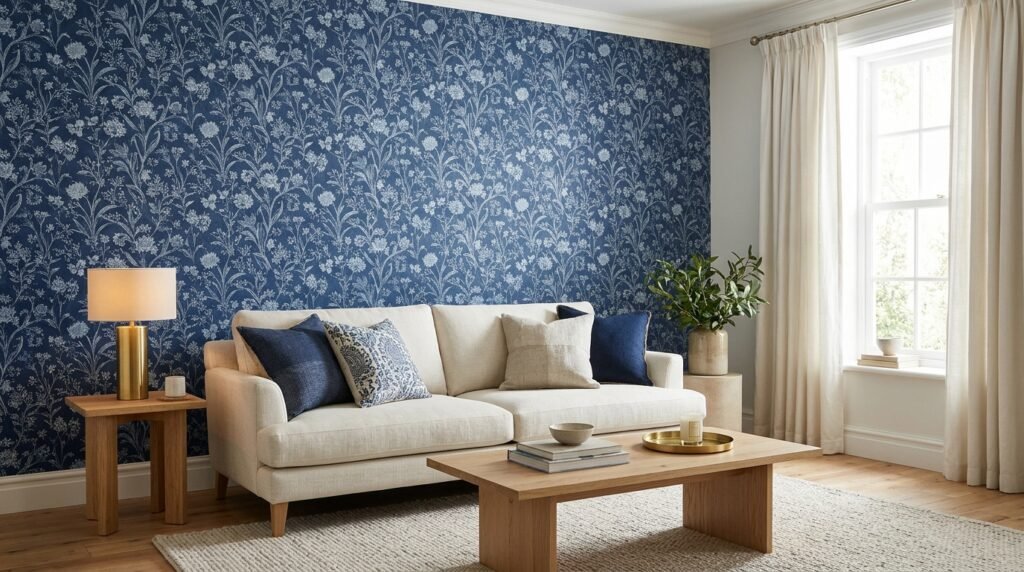
Navy and dark blue create a richer appearance and are often used for feature walls. Their deep color provides contrast against cream furniture, white trim, brass details, and warm wooden surfaces. A navy floral design can suit a traditional bedroom, while a simple geometric print may work better in a modern office. Dark shades can also make a large room feel more intimate and visually grounded. However, they need careful planning in small or poorly lit spaces. A dark wall may absorb more light visually and make the room feel enclosed if the rest of the decoration is also dark. Lighter curtains, pale flooring, mirrors, and suitable lighting can help balance the effect. A dark design does not automatically make a room look smaller, but its overall impact depends on the available light and surrounding surfaces.
Royal Blue and Cobalt Blue
Royal blue and cobalt are more vivid than navy or slate. They bring strong color to an interior and can create a confident decorative statement. These shades work particularly well as accent walls, especially when the other walls use white, cream, or a soft neutral color. Geometric designs, modern abstract prints, and simple repeating patterns can make vivid blue feel organized rather than overwhelming. In a bedroom, a bold design behind the bed can create a clear focal point. In a home office, a limited area of cobalt can add personality without covering the entire workspace. Bright blue may compete with colorful furniture or artwork, so it is helpful to keep nearby decorations relatively simple. The goal is to give the color enough space to stand out without making the room visually crowded.
Slate Blue and Dusty Blue
Slate blue and dusty blue have softer, more muted appearances. They often contain gray undertones, which makes them easier to combine with neutral furniture and understated decoration. These shades are useful when a room needs color but a bright or highly saturated design would feel too strong. Slate blue can work in living rooms, hallways, bedrooms, and home offices. It pairs naturally with gray upholstery, warm white walls, oak furniture, and muted green accessories. A textured design can add interest without requiring a large repeating pattern. Dusty blue is also a useful option for people who prefer a traditional appearance but want something less formal than deep navy. Check the undertone carefully because some gray-blue designs can look cooler in rooms with limited sunlight.
Teal and Blue-Green Wallpaper
Teal sits between blue and green, giving it a slightly different character from traditional blue. Depending on its depth, it can look fresh, rich, or dramatic. Pale blue-green tones work well in bathrooms and bedrooms, while deeper teal can create an attractive feature wall in a living or dining room. Botanical prints, tropical leaves, abstract patterns, and textured designs are common ways to use this color family. Teal can be combined with cream, natural wood, muted gold, and selected green accents. Too many competing colors can make the room feel busy, especially when the wallpaper already contains several shades. Choosing one or two supporting colors usually creates a more balanced interior.
Popular Blue Wallpaper Patterns and Designs
Color determines the general mood, but pattern gives a wall its personality. A plain design creates a different result from a detailed floral print, even when both use the same shade. The pattern should match the room’s size, furniture, and existing decoration. Large designs can become a focal point, while smaller repeats provide a more subtle background. Some patterns also suit particular interior styles better than others. For example, traditional floral designs can complement classic furniture, while abstract lines may suit a modern room. Choosing a pattern based only on a product photograph can lead to disappointment because the design may appear larger or busier across a full wall.
Floral and Botanical Designs
Floral wallpaper includes small flowers, large blooms, decorative branches, and detailed garden-inspired prints. Blue backgrounds with white or cream flowers create a traditional appearance. Dark floral designs offer more contrast and can look especially striking behind a bed or dining table. Botanical patterns featuring leaves, trees, or natural shapes provide another option for people who prefer plant-inspired decoration. A large floral print generally needs enough open wall space to remain visually clear. Smaller prints can work in compact rooms, although a very busy design may still feel overwhelming. To keep the room balanced, use simpler curtains, bedding, and furniture fabrics. If the wallpaper contains several colors, select one or two of those colors for nearby accessories.
Geometric and Abstract Patterns
Geometric designs use shapes such as squares, circles, diamonds, triangles, and repeating lines. They are suitable for modern interiors and can give a wall a more structured appearance. Blue and white geometric wallpaper creates clear contrast, while blue and gray designs look more understated. Abstract wallpaper uses less predictable shapes, brush-like marks, and flowing forms. These designs can add movement without showing a recognizable object or scene. A geometric pattern may work well in a home office, hallway, or contemporary living room. Abstract designs can also suit bedrooms when their colors and contrast remain relatively soft. Before purchasing, check how the pattern repeats across the roll. A complex repeat may require more careful alignment during installation.
Striped Blue Wallpaper
Striped wallpaper is a practical option for people who prefer a simple, organized design. Vertical stripes can draw the eye upward and create the impression of greater ceiling height. Horizontal stripes can emphasize the width of a wall. These are visual effects rather than guaranteed changes to a room’s actual dimensions. Wide stripes create a stronger decorative statement, while narrow stripes often look more subtle. Blue and white stripes suit coastal and traditional interiors. Blue and beige stripes create a softer appearance, while navy and cream offer a more formal combination. Accurate installation matters because uneven stripes are easy to notice. The first panel should be positioned carefully, and the remaining panels should follow the pattern alignment.
Blue and White Wallpaper
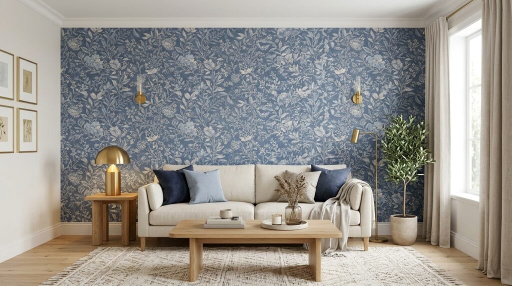
Blue and white is one of the most adaptable wallpaper combinations. The white areas provide contrast, while blue introduces color and pattern. This combination can look traditional, coastal, modern, or decorative depending on the print. Floral designs are suitable for classic rooms, while simple lines and abstract shapes create a cleaner appearance. Blue and white wallpaper can work in kitchens, bedrooms, bathrooms, hallways, and living spaces when the material suits the environment. It also coordinates with white cabinets, pale flooring, and natural wood. However, not every blue-and-white design has the same effect. A high-contrast print can become a major feature, while a low-contrast pattern creates a quieter background.
Textured and Fabric-Inspired Designs
Textured wallpaper adds visual depth without relying entirely on printed images. Some designs imitate linen, woven fabric, grasscloth, or other natural surfaces. Blue textured wallpaper can make a plain wall look more detailed while maintaining a relatively simple color scheme. It is useful in bedrooms, living rooms, and offices where a highly decorative pattern may not be suitable. Actual natural-fiber wallpaper and printed imitations can have different cleaning and maintenance needs. Real grasscloth, for example, should not be treated like washable vinyl. Always check the product’s material and care instructions before choosing it for a busy area. Texture can also make wall imperfections more noticeable or less noticeable depending on its finish and the direction of the light.
Choosing Blue Wallpaper for Different Rooms
A suitable design should match the room’s purpose, lighting, and daily use. A bedroom may need a softer appearance, while a dining area can support a more dramatic pattern. Bathrooms require greater attention to moisture, and hallways need materials that can handle regular contact. The same design does not have to work equally well in every location. Before selecting a product, consider how much wall space it will cover and whether the room contains existing patterns. Furniture, flooring, curtains, rugs, and lighting should all contribute to one coordinated appearance.
Blue Wallpaper for Bedrooms
Bedrooms are suitable for both light and dark blue designs. Pale blue, dusty blue, and soft floral patterns can create a gentle atmosphere. Navy and deep blue can provide a more intimate appearance, particularly behind the bed. A feature wall is a practical starting point when covering every wall would feel excessive. Blue and white patterns work well with light bedding, while navy can coordinate with cream, beige, and warm wooden furniture. Avoid selecting a design solely because it looks attractive in a catalogue. Check how it appears with the bedroom’s actual lighting and existing furniture. A very detailed pattern may also become distracting if the bedding, curtains, and rugs contain strong prints.
Blue Wallpaper for Living Rooms
Living rooms often contain several decorative elements, including sofas, curtains, rugs, artwork, and shelving. The wallpaper should complement these features rather than compete with them. A medium blue geometric pattern can add detail without dominating the room. A scenic mural can create a focal point behind a sofa, while navy wallpaper can provide contrast against light-colored furniture. If the room already has patterned upholstery, a simple or textured design may be a better choice. Blue and cream combinations work well with traditional furniture, while slate blue and gray can suit contemporary spaces. Consider the wall that receives the most attention when entering the room. This is often a useful place for a decorative feature.
Blue Wallpaper for Bathrooms
Blue is a natural decorative choice for bathrooms because it can create a fresh, water-inspired appearance. Pale blue, blue-and-white patterns, and soft coastal designs can complement white bathroom fittings. However, the material matters more than the color in this space. Ordinary wallpaper may not withstand repeated moisture, steam, or direct water exposure. A bathroom product must be specifically suitable for the intended conditions, and the manufacturer’s installation and ventilation instructions should be followed. Keep wallpaper away from areas exposed to direct shower spray unless the product is expressly rated for that use. Poor ventilation can also affect adhesive performance and wall condition. In a bathroom with frequent condensation, a suitable tile or moisture-resistant wall finish may be more practical.
Blue Wallpaper for Kitchens and Dining Rooms
Kitchens and dining rooms can benefit from blue wallpaper when the design is placed thoughtfully. Blue and white prints can create a classic appearance around a breakfast area or dining space. Navy botanical patterns can add depth to a dining room, especially with warm wood furniture and soft lighting. In kitchens, avoid placing ordinary wallpaper close to sinks, cooktops, and areas exposed to grease or frequent splashes. A washable, suitable material may be easier to maintain, but its cleaning instructions should still be checked. A small dining nook or a wall away from cooking activity can be a better location. The wallpaper should also coordinate with cabinet colors, countertops, and flooring.
Blue Wallpaper for Nurseries and Children’s Rooms
Soft blue designs are often chosen for nurseries and children’s bedrooms because they can create a gentle and playful appearance. Clouds, stars, animals, small flowers, and simple geometric patterns are common design choices. A pale background can work with white furniture and light wooden accessories. Older children’s rooms may benefit from brighter blue or more personal designs. Removable wallpaper can be useful when the room’s decoration may change as a child grows. However, the product should still meet the manufacturer’s indoor-use and material guidance. Choose a design that can remain suitable for several years rather than one that depends on a short-lived interest. Keep wall decorations and furniture safely installed according to their instructions.
Blue Wallpaper for Home Offices
A home office needs a comfortable background that works with furniture, lighting, and screen use. Slate blue, muted blue, and simple geometric patterns can add character without creating too much visual activity. Navy may suit a larger office with enough lighting and lighter furniture. If the wallpaper appears behind a desk during video calls, consider how its pattern looks on camera. Very small or high-contrast patterns may appear distracting on some screens. A simple textured design or low-contrast print can create a more controlled background. The color should also work with the desk, shelves, and task lighting. A single feature wall can be enough to give the office a more finished appearance.
How Lighting Changes the Appearance of Blue Wallpaper
Lighting can change how a blue shade looks throughout the day. Natural daylight, warm bulbs, cool bulbs, and shadows all affect its appearance. A pale blue may look brighter near a sunny window but cooler in a shaded corner. Navy can appear almost black under limited lighting, while a vivid cobalt may look stronger in direct sunlight. The direction and amount of daylight also matter. Rooms with limited natural light may benefit from a lighter shade or a carefully planned dark feature wall with suitable lamps. Do not judge a wallpaper sample under only one lighting condition. Place it against the intended wall and observe it in the morning, afternoon, and evening. Also check it beside the flooring and furniture. A sample that looks balanced alone may clash with a warm-colored floor or cool gray sofa. Lighting should be part of the selection process, not something considered after installation.
What Colors Go Well With Blue Wallpaper?
Blue can work with many colors, but the best combination depends on its shade and undertone. White provides a crisp contrast and is especially useful with pale blue and navy. Cream creates a softer and warmer effect. Gray can make blue look modern and understated, although cool gray with a cool blue may feel less welcoming in a dim room. Beige and tan introduce warmth and work well with muted shades. Natural wood adds texture and helps balance darker designs. Brass and gold details can provide a warm accent against navy or deep teal. Mustard, rust, and terracotta can create a stronger contrast with blue, but they are best used in controlled amounts. Green can complement blue in botanical or nature-inspired interiors. Rather than introducing many accent colors, choose one main neutral and one supporting shade. This makes it easier to coordinate curtains, cushions, rugs, and furniture.
Should You Choose a Blue Feature Wall or Cover the Whole Room?
A feature wall is often a sensible way to introduce a strong pattern or dark shade. It gives the design a clear purpose and reduces the amount of wallpaper required. The wall behind a bed, sofa, or dining table can provide a natural focal point. This approach is especially useful when the room already contains colorful furniture or decorative accessories. Covering the entire room can create a more complete appearance, particularly with subtle patterns, soft colors, and textured designs. However, a bold print across every wall may feel visually heavy. Room size alone should not decide the approach. A small room can look attractive with a carefully selected full-room design, while a large room may benefit from one accent wall. Consider the pattern’s contrast, lighting, furniture, and ceiling height before making the decision.
Types of Wallpaper Materials and Their Differences
Wallpaper material affects installation, cleaning, durability, and removal. The design may look similar across different products, but the material can make them suitable for very different situations. Common options include traditional paper, vinyl-coated wallpaper, solid vinyl, non-woven wallpaper, and peel-and-stick products. Some designs combine different materials or use a printed surface over a particular backing. The product description should explain what is being sold. Do not assume every washable wallpaper is waterproof or that every removable product is suitable for every painted surface.
Traditional Paper Wallpaper
Traditional paper wallpaper uses a paper-based surface and generally requires the adhesive method specified by its manufacturer. It can offer detailed prints and a classic finish. However, its cleaning and moisture resistance depend on its construction and coating. Some paper products are more delicate than vinyl alternatives and may not be suitable for busy areas. Installation also requires care because the adhesive and soaking instructions can differ between products. Before buying, check whether paste should be applied to the paper or wall. The correct method helps reduce problems such as stretching, bubbling, and poor adhesion.
Vinyl and Vinyl-Coated Wallpaper
Vinyl wallpaper is available in several constructions. Vinyl-coated paper has a paper base with a vinyl surface or coating, while solid vinyl products use a more substantial vinyl layer. Their cleaning and moisture resistance vary by product. Some are suitable for areas that need more regular cleaning than ordinary paper wallpaper. However, washable does not automatically mean waterproof. Seams, edges, adhesive, and the wall behind the material can still be affected by moisture. Check the product’s cleaning instructions and intended room use. A suitable vinyl design may be useful in a family living space or hallway where occasional marks are a concern.
Non-Woven Wallpaper
Non-woven wallpaper uses a backing made from a combination of fibers. Many products are designed for paste-the-wall installation, which can make fitting more convenient. Some non-woven wallpapers are also designed for easier removal. However, installation methods depend on the individual product. It is important to follow the manufacturer’s instructions rather than assuming every non-woven design works the same way. Blue non-woven wallpaper is available in plain, patterned, textured, and decorative styles. This material can be a useful option for people who want a traditional wallpaper appearance with a different installation process.
Peel-and-Stick Wallpaper
Peel-and-stick wallpaper has an adhesive backing covered by a removable protective layer. It is often selected for temporary decoration, rental properties, small projects, and feature walls. Installation can be simpler because separate wallpaper paste is usually unnecessary. It may also be easier to remove than some traditional products. However, performance depends on the wall surface, adhesive quality, temperature, and product instructions. Dusty, damp, rough, or freshly painted walls can cause adhesion problems. Some paints or wall finishes may also be damaged during removal. Test a sample in an inconspicuous area and follow the manufacturer’s guidance. Do not assume a removable label guarantees damage-free removal on every surface.
How to Measure a Wall Before Buying Wallpaper
Accurate measurements help prevent shortages and unnecessary leftover material. Start by measuring the wall’s width and height. Multiply these measurements to estimate the wall area. If a room has several walls, measure each one separately and add the results. Doors and windows can be measured, but it is often sensible to allow extra material for cutting, pattern alignment, and installation mistakes. Wallpaper is sold in different roll sizes, so check the coverage listed by the manufacturer rather than assuming every roll covers the same area. Pattern repeats can also affect the number of rolls required. A large repeating design may create more waste because each strip must align with the next one. If a design has a straight match or drop match, check its specifications before calculating the quantity. When measurements are unusual or the pattern is complex, ask the wallpaper supplier for a roll calculation. Buying all the required rolls from the same production batch can also help reduce visible differences in color.
How to Prepare Walls Before Installing Wallpaper
Good wall preparation is essential for a clean finish. Begin by removing dust, loose paint, grease, and other surface contamination using a method suitable for the existing wall finish. Repair holes and cracks with an appropriate filler, then allow repairs to dry fully. Sand rough areas where necessary and remove the resulting dust. The wall should be stable, clean, and dry before installation. Check for peeling paint, damp patches, mold, and other signs of damage. Wallpaper should not be used to hide an unresolved moisture problem. If mold or persistent dampness is present, identify and address the cause first. Freshly painted walls may need time to cure before wallpaper can be applied. Follow the paint and wallpaper manufacturers’ instructions for the required waiting period. Depending on the surface, a suitable primer or wall sealer may also be needed. Preparation takes time, but it helps prevent bubbles, loose edges, and uneven adhesion.
How to Install Blue Wallpaper Correctly
Installation depends on the wallpaper material and adhesive system. Read the product instructions before opening the rolls because different designs require different methods. For paste-the-wall products, apply the recommended adhesive evenly to the wall. For paste-the-paper products, follow the stated soaking time and avoid stretching the material. Peel-and-stick wallpaper should be applied gradually, removing the backing in manageable sections. Start from a carefully measured vertical line rather than assuming the corner is perfectly straight. Position the first strip and smooth it gently with a suitable tool. Work from the center outward to reduce trapped air. Align the pattern before pressing the next strip into place. Trim excess material carefully around ceilings, skirting boards, windows, and sockets, while following electrical safety guidance. Avoid pulling or stretching the wallpaper to force an incorrect match. If the design begins to drift, correct its position early instead of continuing with misaligned strips. For complicated patterns, high ceilings, or expensive materials, professional installation may be a better option.
Common Mistakes to Avoid When Choosing Blue Wallpaper
One common mistake is choosing a shade from a small online photograph without checking a physical sample. Screen settings and room lighting can make colors appear different. Another problem is selecting a pattern that competes with existing curtains, rugs, and furniture. A large floral print may look attractive in a product photograph but become overwhelming in a room filled with other patterns. Ignoring wall condition can also cause installation problems. Wallpaper cannot correct dampness, loose paint, or serious surface damage. Buyers sometimes choose peel-and-stick products without checking whether the wall finish supports the adhesive. Others assume washable wallpaper can be used in direct water exposure. These assumptions can lead to peeling, stains, or damage. Measuring without allowing for pattern repeats is another avoidable error. Before ordering, confirm the roll dimensions, coverage, material, pattern match, and intended room use. A little planning can prevent expensive replacement work.
How to Clean and Maintain Blue Wallpaper
Cleaning methods depend on the wallpaper’s surface and manufacturer rating. Some products can be wiped gently with a damp cloth, while others should only be cleaned with a dry or lightly damp method. Delicate paper and natural-fiber designs may require extra care. Always check the cleaning instructions before using water, detergent, or household cleaning products. Test an approved method on a hidden area first. Avoid scrubbing because it can damage printed patterns or surface coatings. Dust can often be removed with a soft cloth or a suitable gentle cleaning attachment. If a seam begins to lift, identify the cause before attempting a repair. Moisture, poor preparation, incorrect adhesive, and wall movement can all affect adhesion. Use only a repair product that is compatible with the wallpaper. Keep rooms ventilated when humidity is a concern, and deal with leaks or dampness promptly. Regular gentle care can help maintain the appearance of the wall.
Is Blue Wallpaper Suitable for Small Rooms?
Yes, blue can work in small rooms, but the shade and design need careful selection. Pale blue and low-contrast patterns can create a lighter visual appearance. Small geometric prints, subtle textures, and delicate stripes may work well when the room has limited wall space. A large dark floral pattern can also be effective as a feature, especially when the rest of the room uses lighter colors. The important factor is visual balance. Covering every surface with a high-contrast design may make a compact room feel busy. Mirrors, suitable lighting, light-colored furniture, and simple window treatments can help create a more open appearance. Do not rely on a single rule that small rooms must always use pale colors. A carefully planned dark design can create an intentional, cozy look.
How to Make Blue Wallpaper Look Modern and Balanced
A modern interior does not require plain walls or expensive furniture. The combination of color, pattern, texture, and spacing creates the overall effect. A simple blue geometric design can work with clean furniture and limited decoration. A textured slate-blue wall can complement natural wood, neutral upholstery, and soft lighting. Navy wallpaper can look contemporary when paired with simple shapes, cream surfaces, and carefully chosen metal details. Avoid using too many decorative patterns in one area. If the wallpaper is detailed, keep nearby curtains and upholstery relatively simple. If the design is plain, introduce interest through rugs, cushions, artwork, and natural materials. The room should feel connected rather than like a collection of unrelated items. A consistent color palette makes even a relatively small decorative update look more deliberate.
Frequently Asked Questions
Is blue wallpaper suitable for every room?
Blue wallpaper can suit most rooms, including bedrooms, living rooms, offices, and dining areas. However, the material must match the conditions of the space. Bathrooms and kitchens need special attention because moisture, steam, and splashes can damage unsuitable products. The shade and pattern should also reflect the room’s lighting and daily use.
Does blue wallpaper make a room look bigger?
Light blue and low-contrast designs can help a room feel brighter and more open. Pale shades may visually recede, particularly when combined with good lighting and light-colored furniture. Dark blue can create a more enclosed or intimate appearance, although careful use on one wall can still look attractive in a small room.
What furniture colors look good with blue wallpaper?
White, cream, beige, gray, and natural wood are useful furniture colors for many blue designs. Navy can work with warm wood and brass details, while pale blue looks attractive with white or light oak. The best combination depends on the wallpaper’s undertone and the amount of contrast in the room.
Is peel-and-stick blue wallpaper easy to remove?
Peel-and-stick products are generally designed for easier removal than many traditional wallpaper types. However, removal depends on the adhesive, wall condition, paint quality, installation period, and manufacturer’s instructions. Some products may leave residue or damage certain painted surfaces. Testing a sample first is a sensible precaution.
Can blue wallpaper be used in a bathroom?
Yes, but the product must be suitable for the bathroom’s moisture conditions. Ordinary wallpaper should not be exposed to repeated steam or direct water unless its manufacturer specifically permits that use. Good ventilation, suitable installation, and keeping the material away from direct shower spray can help reduce problems.
How do I choose the right blue wallpaper for my home?
Start by considering the room’s lighting, furniture, wall size, and intended atmosphere. Choose pale blue for a softer appearance, slate for a muted look, and navy for stronger contrast. Compare samples on the actual wall and check the material, roll coverage, cleaning instructions, and installation requirements before purchasing.
Conclusion
Blue wallpaper offers many ways to improve an interior, from soft and understated decoration to bold feature walls. The right choice depends on more than color alone. Shade, pattern, lighting, material, wall condition, and existing furniture all influence the final result. Pale blue can create an airy appearance, slate blue offers a muted alternative, and navy brings depth and contrast. Floral, geometric, striped, abstract, and textured designs provide different decorative options. Before purchasing, compare samples in the room, measure the walls carefully, and check whether the material suits the intended space. Proper preparation and installation also help prevent common problems. With thoughtful planning, blue wallpaper can create a balanced and attractive room that remains practical for everyday use.