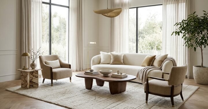
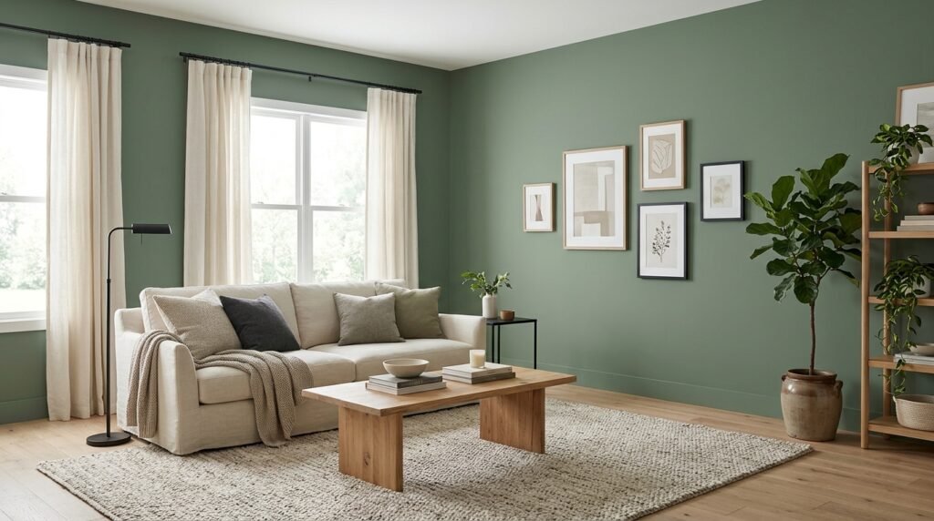
Sherwin-Williams Retreat SW 6207 is a muted green paint color with a noticeable gray influence. It offers more color than a standard gray, but it is softer than a bright or vivid green. This balance makes it worth considering for living rooms, bedrooms, kitchens, cabinets, and selected exterior surfaces. The shade has a published light reflectance value (LRV) of 20.869, placing it on the darker side of the scale. Its appearance can shift with daylight, artificial lighting, nearby finishes, and the size of the painted area. A small sample may look different once it covers an entire wall or set of cabinets. This article explains the color’s character, undertones, light behavior, coordinating colors, room uses, paint finishes, preparation, and common selection mistakes. It also explains how to test Retreat before committing to a full painting project. Sherwin-Williams+1
What Is Sherwin-Williams Retreat?
Retreat is a Sherwin-Williams paint color identified by the code SW 6207. The company places it in the green color family. Its digital color data lists the HEX value as #7A8076 and the LRV as 20.869. Sherwin-Williams Visually, it is a subdued green with a gray cast rather than a clean, bright leaf green. That muted quality helps it work as a strong background color in rooms with natural materials and simple furnishings. It can also add depth to cabinets, doors, or a feature wall. Sherwin-Williams has described Retreat as a moody green with a gray undertone and a restrained splash of green. Sherwin-Williams The color is not a universal match for every room, though. Its depth and undertone should be checked against the fixed finishes and lighting in the space where it will be used.
What Color Does Retreat Look Like?
The official digital color value gives a useful starting point for understanding this shade. Sherwin-Williams lists Retreat as RGB 122, 128, 118, with the HEX code #7A8076. Sherwin-Williams These values describe a muted green that contains a strong gray influence. It does not look like a fresh, yellow-green or a deep forest green. Instead, it has a quiet, earthy appearance that can feel almost gray from a distance. On a large wall, the green character may become easier to notice than it appears on a small paint chip. Nearby colors also affect how the eye reads it. Cream, beige, and warm wood can make the green feel softer. White and cooler gray surfaces may bring out its gray side. This is why online color previews should be treated as references rather than exact promises. A real sample gives a more useful picture of how the shade will look in your home.
Understanding the Undertones
Retreat has a gray undertone that softens its green base. Sherwin-Williams describes it as a moody green with a gray undertone, and a designer quoted on the brand’s website calls it a restrained splash of green. Sherwin-Williams This makes the shade different from brighter sage greens, which can look more yellow or fresh. It also differs from blue-green paints that have a cooler, more aquatic appearance. The gray influence gives it a grounded quality, but the exact balance may change under different lighting. Warm bulbs can make the color seem earthier, while cooler daylight may make its gray-green character more noticeable. It is best not to assume that every room will show the same undertone. If your room has warm floors and cream furniture, compare a sample beside those materials. If it has cool gray tile or white cabinets, test it against those surfaces instead.
Is SW Retreat a Light or Dark Paint Color?
SW Retreat is a relatively dark paint color. Sherwin-Williams lists its light reflectance value at 20.869, which places it well below white and many pale neutral paints. Sherwin-Williams LRV measures the amount of visible light reflected by a painted surface. The scale runs from zero, representing black, to 100, representing pure white. A lower number generally means a color reflects less light. This does not mean Retreat will make every room feel dark. A large room with generous daylight may show it as a balanced, muted green. A small room with limited windows may feel more enclosed when all walls are painted in this shade. The result also depends on ceiling height, wall area, furnishings, and artificial lighting. Consider using it on one wall or on cabinets if you like the color but worry about the room becoming too dark. Test the full color before choosing the final approach.
How Lighting Changes Its Appearance
Lighting can change how a muted green looks throughout the day. Morning daylight, afternoon sun, shaded windows, and evening bulbs do not create the same visual effect. A wall receiving strong daylight may appear clearer and lighter than one in a dark corner. Under warm artificial light, the color may seem more earthy. Under cooler light, its gray influence may become more noticeable. Sherwin-Williams recommends testing paint samples in the room and viewing them under different lighting conditions. Sherwin-Williams This advice is especially useful for a color with a muted base. When testing SW Retreat, check the sample in the morning, afternoon, and evening. View it with the room lights on and off. Also look at the sample from the main seating area and from the doorway. A color that looks attractive close up may feel different across a full wall. If the room has several light sources, check the sample under each one before making a decision.
Using Retreat in a Living Room
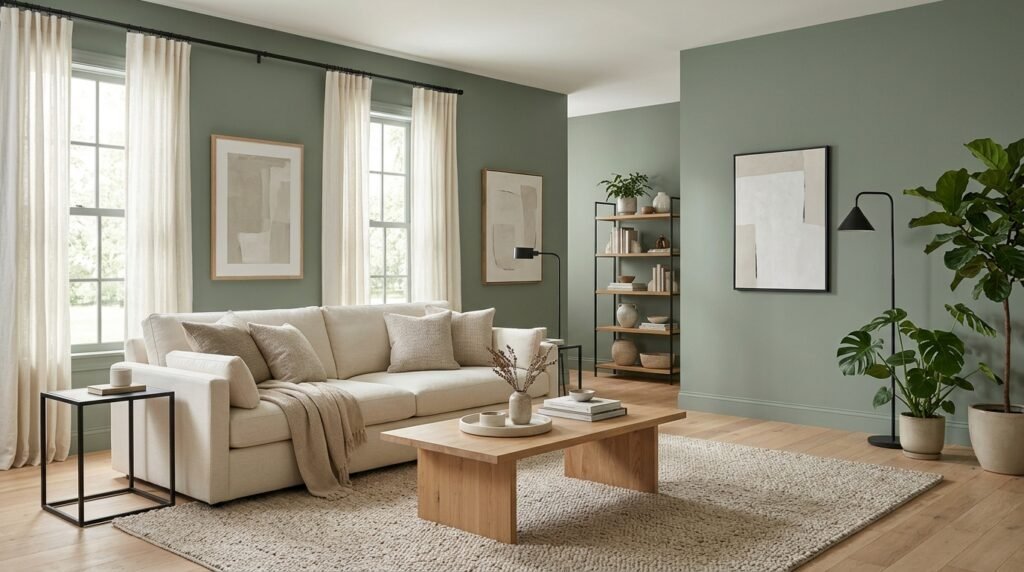
A living room can be a good place for a muted green because it offers room for contrast through furniture and decor. SW Retreat can create a grounded backdrop for cream sofas, natural wood tables, woven rugs, and black metal details. It can also work with leather seating or warm neutral fabrics. The color has enough depth to give a room character without looking like a bright accent green. However, its lower LRV means it may feel heavy in a room with limited daylight. In that situation, consider painting one feature wall rather than every wall. You can also use lighter curtains, pale upholstery, and reflective surfaces to balance the deeper wall color. If the room opens into a kitchen or dining area, compare the paint with the finishes in those connected spaces. A consistent palette can help the rooms feel connected, even when each area has different furniture and accessories.
Using It in a Bedroom
A bedroom can benefit from a muted green when the aim is a quiet, restful appearance. Retreat can work behind a bed, across all four walls, or on selected built-in features. Its gray influence keeps the green from feeling overly bright. Pair it with cream bedding, natural timber, soft white curtains, or restrained patterned fabrics. Darker bedside tables can add definition, while pale rugs can help balance the wall color. In a small bedroom, test the shade carefully before covering every wall. The color may feel deeper at night when the room depends on lamps rather than daylight. If you prefer a lighter bedroom, use it behind the headboard and choose a softer neutral for the other walls. The final choice should suit the room’s light and furniture, not just a staged photograph. A sample beside the bedding and floor will help reveal whether the combination feels balanced.
Is It a Good Choice for Kitchen Cabinets?
Retreat can be considered for kitchen cabinets when you want a muted green rather than a bright color. It may suit natural wood counters, light stone surfaces, white walls, and simple metal hardware. On lower cabinets, it can add color while leaving upper cabinets or walls lighter. On all cabinets, it creates a stronger design statement and needs careful coordination with the floor, backsplash, and countertop. Cabinet surfaces also need suitable preparation. Grease, cooking residue, and glossy old coatings can affect how new paint adheres. Use a paint product designed for the cabinet material and follow its preparation and application instructions. The color name alone does not determine whether a paint product is suitable for cabinets. SW Retreat can look different on a large run of cabinet doors than on a small sample. Test it on a sample board or an inconspicuous area and view it beside the countertop before proceeding.
Using It in Bathrooms and Laundry Rooms
A muted green can add character to bathrooms and laundry rooms, especially when paired with white fixtures and natural textures. Retreat may work on walls, selected cabinetry, or a vanity, depending on the room’s light and surface conditions. In a bathroom with white tile, the contrast can make the green more noticeable. In a room with beige tile or warm wood, the overall palette may feel softer. Moisture and cleaning needs matter as much as appearance. Choose a paint product and finish intended for the surface and room conditions. Sherwin-Williams lists satin and semi-gloss among finishes suited to areas that need regular cleaning, including kitchens and bathrooms. Sherwin-Williams+1 Good ventilation and proper surface preparation are also important. Do not apply ordinary wall paint to a surface that requires a specialist coating. Follow the product label and any instructions for bathrooms, laundry areas, and previously painted surfaces.
Can It Work on Exterior Walls?
Sherwin-Williams lists Retreat for interior and exterior use in its color data. Sherwin-Williams This means the color is available for both types of projects, but the specific paint product still matters. Exterior coatings must be suitable for the surface and local weather conditions. A product made for interior drywall should not be assumed suitable for exterior siding, masonry, or metal. Outside, daylight can make the shade look different from its indoor appearance. Direct sun, shade, nearby trees, roofing, brick, and paving all influence the overall effect. A sample should be viewed outdoors at different times of day. Check it beside the roof, trim, stonework, and other fixed features. If you are painting siding, confirm that the chosen coating is approved for that material. Follow the manufacturer’s directions for cleaning, priming, temperature, and application conditions. For large exterior projects or damaged surfaces, a qualified painting professional can help assess the preparation needed.
Colors That Pair Well With Retreat
Muted green works with a wide range of colors, but the best combination depends on the room’s materials and desired contrast. Warm whites and soft creams can make Retreat feel more welcoming. Light gray can create a quieter, cooler palette, while charcoal adds a stronger contrast. Natural wood introduces warmth and texture. Muted blue, dusty green, and earthy brown can also work as supporting colors when used with care. Sherwin-Williams lists Spare White SW 6203 close to Retreat on its color strip, while the strip also includes related greens such as Sea Salt SW 6204, Comfort Gray SW 6205, and Oyster Bay SW 6206. images.sherwin-williams.com These colors are useful starting points for comparison, but their appearance together should still be tested in the room. A palette can look different under warm bulbs or beside a strong floor color. Use samples rather than assuming colors on the same strip will automatically look right together.
Pairing It With White and Cream
White and cream can help balance the depth of Retreat. A clean white creates a clearer contrast, while a warm off-white can make the combination feel softer. The choice depends on nearby finishes. If the room has cool white tile, a very creamy trim color may look noticeably yellow beside it. If the room contains warm oak or beige flooring, a softer white may create a more natural transition. Spare White SW 6203 is one nearby color on the Sherwin-Williams strip and can be tested as a possible companion. images.sherwin-williams.com It should not be treated as a guaranteed match for every space. Paint a sample beside the proposed trim and check it in daylight and evening light. Also consider the ceiling color. A strong difference between the ceiling, trim, and walls can create a crisp look, while closer shades create a more blended finish. Both approaches can work when the undertones are considered.
Pairing It With Wood, Stone, and Metal
Natural materials can make a muted green feel more balanced and less flat. Light oak and maple may create a gentle contrast, while walnut and darker woods can make the room feel richer. Stone surfaces bring their own undertones. Some have warm beige or brown markings, while others lean gray or blue. Compare the paint sample with the actual stone rather than a similar image. Metal finishes also influence the final look. Black hardware creates a strong outline, while brushed brass can add warmth. Chrome and stainless steel often produce a cooler effect. SW Retreat can sit comfortably among these materials when their tones are considered together. Avoid selecting each item separately without checking the full combination. A green wall, warm floor, cool countertop, and bright white trim may compete if their undertones do not work together. Place samples and material swatches beside one another before buying paint or hardware.
Retreat Compared With Other Green Paint Colors
Not all muted greens have the same depth or undertone. Some sage shades are lighter and softer, while olive greens may look more yellow or earthy. Blue-green colors can feel cooler and more coastal. Retreat has a gray influence and a lower LRV, so it generally looks deeper than pale sage shades. Sherwin-Williams places it among its green colors and lists an LRV of 20.869. Sherwin-Williams When comparing it with another green, look at three things: lightness, undertone, and saturation. Lightness tells you how dark the color appears. Undertone helps explain whether it leans gray, yellow, or blue. Saturation describes how strong or muted the color looks. Compare samples on the same wall under the same light. This makes the differences easier to see than looking at separate online images. Choose the shade that works with the room rather than the one that looks best on a color card.
Retreat Compared With Gray and Greige
Gray and greige paints can appear similar to muted green from a distance, especially when the green has a strong gray influence. The key difference is the visible color family. A true gray is built around a neutral gray appearance, while greige combines gray and beige. Retreat has a green base, even though the gray influence softens it. This distinction matters when choosing a whole-room palette. If you want a room to feel neutral with only a slight hint of color, a gray or greige may be more suitable. If you want the walls to show a clear but restrained green character, Retreat is a more direct option. It can also work as an accent beside gray walls. Test the colors together because some gray paints contain blue or violet undertones. Those undertones may create a different effect beside muted green than a neutral gray would.
Choosing the Right Paint Finish
Paint finish affects shine, cleaning, and how clearly surface flaws appear. It does not change the basic color code, but it can change how the painted surface looks under light. Flat and matte finishes reflect less light and can help hide small wall imperfections. Satin and eggshell have more sheen and are often easier to clean. Semi-gloss is commonly used on trim, doors, and surfaces that need frequent cleaning. Sherwin-Williams explains these differences in its finish guidance. Sherwin-Williams+1 For a living room or bedroom, matte or eggshell may suit the desired look. For a busy hallway, satin may be more practical. Cabinets and trim often need a tougher coating designed for those surfaces. Do not choose a finish only because it looks attractive in a photograph. Consider how often the surface will be touched, how much cleaning it needs, and whether the wall is smooth. Always check the recommendations for the exact paint product.
How to Test SW Retreat Before Painting
A physical sample is the safest way to judge a paint color in its intended setting. Sherwin-Williams offers a Color To Go sample for SW 6207 and explains that samples help homeowners see how a color looks throughout the day. Sherwin-Williams Apply the sample to a suitable test area or sample board, following the product instructions. If using a board, move it around the room to compare different walls and light conditions. Check it near the floor, trim, cabinets, and large furniture. View it in daylight and after turning on the usual lamps. Do not judge the color while the sample is wet. Allow it to dry as directed. Also look at it from a normal viewing distance rather than standing close to the wall. If you are painting several rooms, test each one separately. A north-facing room, a bright kitchen, and a shaded hallway may show the same shade differently.
Preparing Walls and Cabinets for Painting
Good preparation helps paint form an even, lasting finish. Start by checking the surface for dust, grease, loose paint, cracks, holes, and peeling areas. Remove loose material and repair damage with products suitable for the surface. Clean the area and allow it to dry fully. Glossy surfaces may need additional preparation so the new coating can bond properly. Use a primer when the paint manufacturer recommends one for the existing surface, stains, repairs, or major color changes. Cabinet preparation may require extra care because kitchen doors can hold grease and cooking residue. Remove or protect hardware where needed, and label doors if taking them off. Cover floors, counters, and nearby furniture. Use suitable ventilation and follow the safety directions on the product label. Do not skip drying or curing times between coats. Applying another coat too soon can affect the final finish. For surfaces with peeling, moisture damage, or unknown old coatings, identify and address the problem before painting.
Common Mistakes When Choosing Retreat
One mistake is assuming that the color will look exactly like its online image. Digital screens vary, and Sherwin-Williams warns that displayed colors may not accurately represent the actual paint. Sherwin-Williams+1 Another mistake is ignoring the room’s light. A dark green-gray may look balanced in a bright room but heavy in a shaded one. Some people also compare paint samples against a blank white background instead of nearby flooring and furniture. This can hide undertone problems that become clear after painting. Choosing a finish without considering cleaning needs is another common issue. A delicate flat finish may not be ideal for a busy hallway or frequently touched cabinets. Finally, do not buy all the paint before checking the sample over a full day. Take time to compare the color with the room’s permanent features. A careful test is easier than repainting an entire space after an unsuitable choice.
How to Balance a Darker Green in a Small Room
A smaller room does not automatically rule out a darker paint color. The key is to decide how much of the room should carry that color. If all four walls feel too deep, use Retreat on one wall, a vanity, a built-in shelf, or lower cabinets. Keep other large surfaces lighter to create contrast. Pale curtains can allow more daylight into the room, while a light rug can reduce the visual weight near the floor. Mirrors may help spread existing light, although they cannot replace natural or artificial lighting. Avoid filling every surface with dark furniture and heavy fabrics. A few lighter elements can make the palette feel more balanced. If the room has low ceilings or a small window, test the color on the wall that receives the most light. The sample will show whether the shade feels calm or too strong for the space.
Cleaning and Maintaining Painted Surfaces
Painted walls and cabinets need care that matches their finish and product instructions. Dust can be removed with a soft cloth or suitable vacuum brush. For marks, start with a mild cleaning method and avoid abrasive pads. Sherwin-Williams recommends considering the paint sheen before cleaning, since flat and matte surfaces may be less durable than satin or semi-gloss. It also advises using non-abrasive cloths or sponges and mild cleaning solutions. Sherwin-Williams Test any cleaning method in a hidden area first. Do not scrub hard enough to polish or remove the paint film. Keep leftover paint sealed and store it according to the label. Record the color code, product name, finish, and application date for future touch-ups. If the wall has water stains, peeling, or recurring marks, find the cause before repainting. A fresh coat will not solve an ongoing leak or surface problem.
Is SW Retreat the Right Color for Your Home?
SW Retreat may suit a home that needs a muted green with a strong gray influence. It can bring more character than a standard gray while remaining softer than a bright green. Its depth makes it useful for selected walls, cabinetry, bedrooms, and living spaces, provided the lighting supports the choice. It may be less suitable if you want a pale green, a bright airy wall color, or a very neutral gray. The published LRV of 20.869 is worth considering if the room has limited daylight. Sherwin-Williams Think about the fixed elements first: flooring, countertops, trim, windows, and large furniture. Then test the shade beside those materials. A color that works in a staged room may not suit a different home with different light and finishes. The best choice is the one that looks balanced in the actual space throughout the day.
Frequently Asked Questions
What is the Sherwin-Williams code for Retreat?
The Sherwin-Williams code is SW 6207. Use this code when looking up the color, requesting a paint sample, or asking a store to mix it. This helps avoid confusion with other green shades that have similar names.
Is SW Retreat green or gray?
SW Retreat belongs to Sherwin-Williams’ green color family, but it has a noticeable gray influence. The brand describes it as a moody green with a gray undertone. It is best understood as a muted gray-green rather than a standard gray. Sherwin-Williams
What is the LRV of Retreat SW 6207?
Sherwin-Williams lists the LRV as 20.869. This indicates that the color reflects less visible light than pale neutrals and whites. The room may still look brighter or darker depending on windows, lighting, surface area, and nearby colors. Sherwin-Williams
Does Retreat look darker in a room with little natural light?
It can feel deeper in a room with limited daylight because it has a relatively low LRV. Artificial lighting and surrounding finishes also affect its appearance. Test a sample in the actual room before painting every wall.
What colors go with SW Retreat?
Warm whites, soft creams, natural wood, charcoal, and selected muted greens can work with Retreat. Sherwin-Williams’ color strip places Spare White SW 6203 nearby, which can be tested as a possible companion. Always compare samples in the room before choosing a palette. images.sherwin-williams.com
Can Retreat be used on kitchen cabinets?
It can be used as a cabinet color when paired with a suitable coating and proper surface preparation. Clean and prepare the cabinets carefully, then follow the paint manufacturer’s instructions for primer, application, and drying. Test the color beside the countertop and backsplash before starting.
Final Thoughts
SW Retreat is a muted green with a gray influence and a deeper appearance than pale sage shades. Its LRV of 20.869 makes it important to consider the amount of daylight in the room. It can suit living rooms, bedrooms, kitchen cabinets, bathrooms, and exterior projects when the chosen paint product is appropriate for the surface. Warm whites, natural wood, and restrained accent colors can help create a balanced palette. The most reliable way to choose it is to test a physical sample beside your existing finishes and view it at different times of day. Do not rely on a screen image or a paint chip alone. A little testing before the project can help prevent an expensive color mistake.