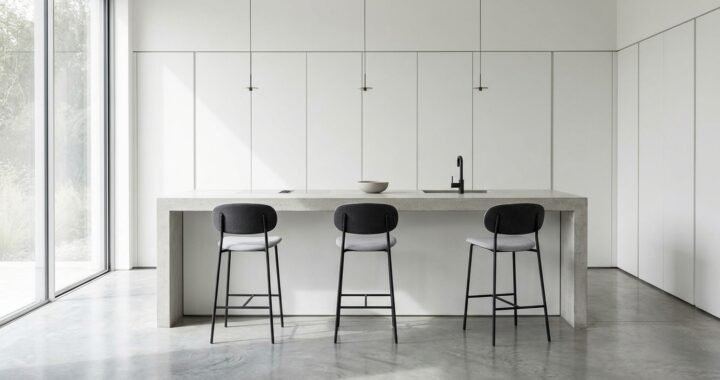

Gossamer Veil is a soft neutral paint color from Sherwin-Williams, listed as SW 9165. It sits between gray and beige, which makes it a popular option for people who want a calm wall color without choosing plain white. However, its appearance can change with daylight, artificial lighting, nearby colors, and paint finish. It may look more gray in one room and more beige in another. Sherwin-Williams describes it as a cool, mist-gray neutral and recommends it for spaces such as bedrooms and family rooms. Its official color page also lists coordinating shades, including Eider White, African Gray, and Anchors Aweigh. This guide explains the color, its undertones, how it behaves in different rooms, which colors work beside it, and what to check before buying paint. It also covers sampling, finish selection, preparation, and common decorating mistakes so you can decide whether this neutral suits your home. Sherwin-Williams+1
What Is Gossamer Veil?
Gossamer Veil is a Sherwin-Williams paint color with the code SW 9165. It belongs to the brand’s neutral color range and is designed to create a soft, understated look. The color is not a pure gray, bright white, or strong beige. Instead, it occupies the space between these familiar neutral shades. That quality makes it useful in rooms where a strong wall color could feel too bold. Sherwin-Williams describes it as a cool, mist-gray neutral that can create an airy and relaxing mood. The company specifically highlights bedrooms and family rooms as suitable spaces. Still, the final appearance depends on the room. A wall beside warm wood may look different from one beside cool white trim. The paint itself does not change, but the light and surrounding colors affect how the eye reads it. Sherwin-Williams+1
What Color Is Gossamer Veil SW 9165?
Gossamer Veil is best described as a light greige, meaning a color between gray and beige. Its appearance is muted rather than bright or strongly saturated. The official Sherwin-Williams color data lists the color as a neutral and provides the digital color value #D3CEC4. This value can help identify the shade in design software, but it should not be treated as a perfect preview of painted walls. Screens use different brightness and color settings, while real paint interacts with room lighting and surface texture. On a wall, the shade may appear soft gray, warm gray, or beige-gray depending on its surroundings. It is therefore more useful to think of it as a flexible neutral than to expect one fixed appearance in every home. A physical sample is the better way to judge its look in your own space. Sherwin-Williams+1
Understanding Its Undertones
Undertones are the subtle colors that influence how a neutral paint shade appears. They are especially important when choosing gray, beige, greige, and off-white paints. Gossamer Veil can be read as a gray neutral, but its beige influence may become more noticeable beside cooler colors. Sherwin-Williams has described the shade as a warm greige with subtle beige undertones in its color guidance. Its main color page, however, calls it a cool, mist-gray neutral. These descriptions show why paint labels can sometimes feel confusing: a color can sit between warm and cool, and its appearance changes with the colors around it. Sherwin-Williams+1 If your room has warm wood floors, cream fabrics, or tan furniture, the beige side may stand out more. In a room with cool gray flooring or blue accents, the gray side may become more noticeable. This does not mean the paint is inconsistent. It means surrounding colors influence visual perception. Test it beside the fixed materials in your room before making a final decision.
How Light Changes the Color
Lighting is one of the main reasons a paint sample can look different from the color shown online. Natural daylight changes throughout the day, while bulbs can produce warm, neutral, or cool light. A wall facing a bright window may look lighter than a wall in a shaded corner. The same paint can also appear different in a room with large windows compared with one that receives little daylight. Sherwin-Williams advises testing colors in the room and viewing them under different lighting conditions. Sherwin-Williams When evaluating Gossamer Veil, look at the sample in the morning, afternoon, and evening. Check it with the lights on as well as with natural light alone. Avoid judging the shade from one small image on a phone. If the room has warm bulbs, the color may appear warmer than expected. Cool lighting may make its gray character more noticeable. Your fixed furniture, flooring, and window direction also matter.
Is It a Warm Gray or a Cool Gray?
Gossamer Veil does not fit neatly into a simple warm-gray or cool-gray category. Its visual character can shift because it sits close to the boundary between gray and beige. Sherwin-Williams presents it as a cool, mist-gray neutral on its official color page, while its color guidance describes subtle beige undertones. Sherwin-Williams+1 Both descriptions can help explain why homeowners may see different qualities in the same shade. If you want a clearly cool gray with a blue cast, this may not deliver that result. If you want a strong beige, it may also feel too gray. It is more suitable for someone seeking a restrained neutral that can work with several natural materials. The best test is to compare it with the other colors already in the room. Place the sample beside the floor, trim, countertop, or large furniture pieces. That comparison is more useful than judging it against a blank white screen.
Rooms Where This Neutral Can Work
A neutral wall color can support many room styles, but suitability depends on the room’s light, layout, and materials. Sherwin-Williams highlights bedrooms and family rooms for this shade, while its website also displays examples of it in living rooms, dining rooms, and bathrooms. Sherwin-Williams+1 That does not mean it will look identical or work equally well in every space. A bedroom with soft fabrics may make the color feel restful, while a busy family room may need stronger contrast from furniture and trim. In an open-plan home, it can also provide a quiet background between connected areas. Before painting several rooms, test the color in each space. Rooms facing different directions or receiving different amounts of daylight may show different results. A sample that looks right in the hallway may not look the same in a darker bedroom.
Using It in a Living Room

A living room often contains several large surfaces, including walls, flooring, sofas, curtains, and rugs. A soft neutral can help these elements feel connected without competing for attention. Gossamer Veil may suit a living room with natural wood, cream upholstery, charcoal details, or muted green accents. Darker furniture can create contrast against the lighter wall color, while pale fabrics can produce a softer, more blended look. Consider the room’s fixed features before choosing accessories. If the floor has strong orange or red undertones, test the paint beside it first. If the sofa is cool gray, check whether the wall looks too beige by comparison. The goal is not to match every item exactly. A room often looks more balanced when textures and tones vary slightly. A sample on the actual wall will show whether the color supports the room’s furniture and natural light.
Using It in a Bedroom
Bedrooms often benefit from colors that do not feel visually demanding. A muted gray-beige neutral can create a calm background for bedding, curtains, and wooden furniture. Gossamer Veil may work well with white bedding, soft taupe fabrics, natural oak, or darker bedside furniture. It can also support a simple design with limited decoration. However, a small or poorly lit bedroom may make the color appear darker or more beige than expected. Test it behind the bed and on another wall before painting the full room. Look at it with the curtains open and closed. Check the shade with bedside lamps turned on because evening lighting can change its appearance. If the room already contains several cool gray items, compare the sample with them. This helps prevent an unexpected contrast once the paint covers all four walls.
Is It Suitable for Kitchens and Bathrooms?
A neutral shade can work in kitchens and bathrooms, but the paint color and paint finish are separate decisions. The color determines the visual appearance. The finish affects shine, cleaning, and how surface marks may show. In a kitchen, compare the sample with cabinets, counters, backsplash tiles, and flooring. Warm wood cabinets may bring out its beige side, while cool stone surfaces may emphasize gray. In a bathroom, check it beside the tile, vanity, mirror, and lighting. Bathrooms can have limited daylight, so a sample viewed under the room’s actual bulbs is especially useful. Choose a paint product and finish that are suitable for the surface and moisture conditions. Do not assume that every paint line or sheen has identical performance. Follow the manufacturer’s product label for the intended room and surface.
Coordinating Colors Listed by Sherwin-Williams
Sherwin-Williams lists three coordinating colors on the official Gossamer Veil page: Eider White SW 7014, African Gray SW 9162, and Anchors Aweigh SW 9179. Sherwin-Williams+1 These shades offer different ways to create contrast and visual structure. Eider White can provide a lighter companion for trim or nearby spaces. African Gray is a darker gray option that can help define architectural details. Anchors Aweigh offers a deeper blue-toned contrast for selected features or accents. These are manufacturer-listed coordinating choices, not a rule that every room must use all three. A successful palette also depends on flooring, furniture, natural materials, and personal preference. Try each proposed combination in the room before committing. Place physical samples beside one another and check them in both daylight and artificial light. This can reveal whether the colors feel balanced or whether one shade makes another appear unexpectedly warm or cool.
Pairing It With White Trim
White trim can make a neutral wall color look crisp and finished, but the type of white matters. A very cool white may make the beige influence in Gossamer Veil look more noticeable. A warmer white may create a softer transition between the wall and trim. Sherwin-Williams lists Eider White as a coordinating color, making it one manufacturer-supported option to test. Sherwin-Williams You can also compare other whites already used in your home, especially if you are not repainting every room. Check doors, window frames, baseboards, and ceiling paint together. A white that looks clean on its own may appear yellow or blue beside another neutral. Avoid choosing trim paint from a small online swatch alone. View larger samples next to the wall color under the same lighting. This simple comparison can prevent a mismatch that becomes obvious after the full room is painted.
Furniture and Decor That Complement It
The most useful decor choices depend on the room’s existing palette rather than a fixed matching formula. Natural wood can add warmth, while black or charcoal details can provide stronger definition. Cream, ivory, and oatmeal fabrics may create a soft neutral scheme. Muted green or blue accessories can introduce color without overwhelming the walls. Textures also matter. Linen curtains, woven baskets, wool rugs, and wood furniture can add depth even when the colors remain restrained. If the room already contains gray furniture, use a sample to check whether the wall color appears too beige beside it. If the room has warm tan furniture, make sure the wall does not become too gray. Gossamer Veil can be treated as a background color, allowing art, furniture, and fabrics to provide the stronger visual details. The aim is a balanced room, not an exact match between every object.
How It Compares With Other Neutral Paint Colors
Comparing paint colors is easier when you look at their undertones, depth, and relationship to the room. A pale gray may look cooler and more clearly gray. A beige may look warmer and more earthy. A greige sits between these families, but each shade has its own balance. Gossamer Veil is a useful option to test if you do not want a strong beige or a distinctly blue-gray wall. It should not be assumed to be a universal middle ground, because lighting can make it appear warmer or cooler. Compare it with the other colors you are considering on large sample areas. Put them on the same wall if possible, with enough space between samples to judge each one separately. Observe them at different times of day. This makes it easier to see which color works with the room rather than selecting one based on a product photo.
What Does Its Light Reflectance Value Mean?
Light reflectance value, commonly shortened to LRV, describes how much visible light a color reflects. Sherwin-Williams lists an LRV of 61.829 for Gossamer Veil in its color data. Sherwin-Williams The figure can help compare the relative lightness of paint colors, but it does not predict exactly how bright a room will feel. Room size, window placement, wall area, surface finish, and artificial lighting all affect the result. A room with limited daylight may still feel dim even when the walls use a relatively light neutral. Likewise, a bright room can make a color appear lighter than expected. LRV is best used as one comparison point rather than a promise about the final look. If you are choosing paint for a small room, compare samples under the lighting available there. The actual sample will tell you more about the room’s appearance than the number alone.
How to Sample the Color Before Painting
Sampling is one of the most useful steps in choosing a wall color. Sherwin-Williams offers a color chip and sample options for Gossamer Veil, including a peel-and-stick option on its official page. The brand also advises viewing physical samples because digital color displays can vary. Sherwin-Williams+1 Start by placing the sample on a wall that receives the room’s normal light. If possible, check more than one wall because light can differ across the space. Look at the sample during the morning, afternoon, and evening. Compare it with the floor, trim, cabinets, and large furniture. Do not judge it only beside a bright white sheet of paper, because that can change how the neutral appears. If using a paint sample, follow the product instructions and allow it to dry before judging the result. Wet paint can look different from its final dry appearance. Take time with the sample before buying enough paint for the full project.
Choosing the Right Paint Finish
The paint finish is the level of shine or gloss on the painted surface. It can affect how a color looks and how easily the surface can be cleaned. Sherwin-Williams explains that flat and matte finishes help reduce the appearance of surface imperfections, while satin and semi-gloss finishes are often selected for areas that need more cleaning. Sherwin-Williams+1 For a living room or bedroom, matte, eggshell, or satin may be worth comparing, depending on the product line and household needs. A kitchen or bathroom may need a finish designed for more frequent cleaning and moisture exposure. Trim and doors often use a higher sheen than walls. Do not choose a finish based on color alone. Consider the condition of the surface, how often it will be touched, and the cleaning needs of the room. Always check the specific paint product’s label because finish names and performance can vary by product.
Preparing Walls Before Painting
A good paint result depends on more than the shade selected. Before painting, inspect the walls for dust, grease, loose paint, cracks, holes, and areas with peeling finish. Remove loose material and repair damaged spots using suitable products for the wall surface. Clean the surface as directed by the paint manufacturer and allow it to dry fully. Glossy or uneven areas may need preparation before repainting. Use the primer recommended for the surface and the condition of the existing coating. For example, stains or major color changes may require a suitable primer rather than an extra coat of ordinary wall paint. Protect floors, furniture, switches, and trim before starting. Use appropriate ventilation and follow the safety instructions on the product label. Do not rush preparation to save time. A carefully prepared wall gives the new paint a more even surface and helps reduce visible defects after the finish dries.
Common Mistakes to Avoid
One common mistake is choosing the color from a small online image and expecting the wall to look exactly the same. Screens vary, and room lighting changes the appearance of paint. Another mistake is testing the sample in a room that has different lighting from the space being painted. A third is ignoring fixed materials such as flooring, countertops, tile, or large furniture. These items remain in place and can affect how the wall color appears. Some people also choose a finish without considering cleaning needs or wall condition. A high-sheen finish can draw attention to surface flaws, while a very flat finish may be harder to clean in a busy area. Avoid buying all the paint before checking a physical sample. Also, do not assume that a coordinating color shown online will work equally well in every home. Test the complete palette in the actual room and make the decision after viewing it under normal conditions.
Is Gossamer Veil Right for Your Home?
This shade may suit a home that needs a soft neutral between gray and beige. It can be worth considering if bright white feels too stark and a stronger beige feels too warm. It may also work for people who want a calm background for natural wood, neutral fabrics, or darker accents. However, it may not be the right choice if you want a clearly cool gray, a strong beige, or a high-contrast wall color. Its appearance can shift depending on lighting and nearby finishes, so it should not be selected from its name alone. Consider the room’s natural light, fixed materials, furniture, and preferred atmosphere. If you are repainting several connected rooms, test the color in each area rather than assuming it will look identical throughout the home. A careful sample test is more reliable than relying on online room photographs or color descriptions.
Frequently Asked Questions
Is Gossamer Veil a gray or beige paint color?
Gossamer Veil is a greige, which means it sits between gray and beige. Sherwin-Williams describes it as a cool, mist-gray neutral, while its color guidance also refers to subtle beige undertones. Its appearance can shift with lighting and nearby colors. Sherwin-Williams+1
What is the Sherwin-Williams code for Gossamer Veil?
The official color code is SW 9165. Use this code when searching for the color, requesting a sample, or discussing it with a Sherwin-Williams store. Checking the code helps avoid confusion with other colors that have similar names.
What is the LRV of Gossamer Veil?
Sherwin-Williams lists an LRV of 61.829 for this color. LRV measures the amount of visible light a color reflects, but it does not guarantee how bright a room will look. Room lighting, windows, wall surfaces, and paint finish also affect the result. Sherwin-Williams
What colors coordinate with Gossamer Veil?
Sherwin-Williams lists Eider White SW 7014, African Gray SW 9162, and Anchors Aweigh SW 9179 as coordinating colors. These options offer lighter, darker, and contrasting directions. Test them together in your room before choosing a final palette. Sherwin-Williams
Is Gossamer Veil suitable for a living room?
It can be suitable for a living room, especially if you want a muted neutral background. Sherwin-Williams includes family rooms among its suggested spaces and shows real-home examples in living areas. Check the shade with your flooring, furniture, and lighting before painting the full room. Sherwin-Williams+1
Should I test Gossamer Veil before buying paint?
Yes. A physical sample helps you see how the color behaves under your home’s lighting and beside existing finishes. Check it at different times of day and after the sample has dried. Sherwin-Williams also advises viewing a physical sample because on-screen color may vary. Sherwin-Williams+1
Final Thoughts
Gossamer Veil SW 9165 is a restrained neutral that sits between gray and beige. Its appeal comes from this balance, but that same quality means it can look different from one room to another. Sherwin-Williams describes it as a mist-gray neutral and lists several coordinating colors, including Eider White, African Gray, and Anchors Aweigh. Its published LRV is 61.829, which provides a useful reference when comparing paint shades. Still, no digital value or room photograph can replace a real sample in your home. Check the color beside your flooring, trim, furniture, and other fixed finishes. View it in daylight and under your usual evening lights before making a final choice. If the sample looks balanced throughout the day and supports the room’s existing materials, it may be a practical neutral for your project.