Choosing the right bathroom paint colors is less about following a trend and more about understanding light, fixed finishes, room size, and the mood you want to create. Soft whites, warm neutrals, pale greens, muted blues, earthy tones, and deeper dramatic shades can all work beautifully when they complement the tile, vanity, countertop, flooring, and lighting already in the room. A small bathroom does not automatically need white, and a dark color does not automatically make a room feel cramped. The relationship between color, contrast, lighting, and surrounding materials matters more. Bathrooms also have one practical concern that bedrooms and living rooms may not share to the same degree: regular moisture. Color is only part of the paint decision. The coating should also be appropriate for a humid bathroom environment, and ventilation needs to control moisture rather than relying on paint alone. This guide explains how to choose colors for small and large bathrooms, match them with existing finishes, test samples correctly, select an appropriate sheen, and avoid common mistakes before repainting.
Start With the Bathroom’s Fixed Features
Before looking through dozens of paint samples, identify everything in the bathroom that will remain after painting. This usually includes floor tile, shower tile, countertops, vanity cabinets, bathtub, toilet, metal finishes, and sometimes stone or permanent wall panels. These surfaces should guide your bathroom paint colors because replacing them is usually more difficult than repainting walls. Look closely at their undertones. A white marble-look countertop may contain cool gray veining, while beige stone may have cream, gold, taupe, or even subtle pink undertones. Warm wood cabinets can look disconnected beside an icy gray wall, while a slightly warmer neutral may connect them naturally. You do not need every surface to match. In fact, an exact match can make a room look flat. Instead, look for colors that relate comfortably to the permanent finishes. Take paint samples into the bathroom rather than choosing under store lighting. The goal is to build a coordinated palette around what already exists.
Understand Warm and Cool Undertones
Two colors that appear almost identical on a small sample can behave very differently once they cover an entire wall. Undertones explain much of that difference. Warm whites may lean cream, beige, peach, or yellow. Cool whites may have gray, blue, or subtle green influences. Gray can lean warm and taupe-like or cool and blue-based. Even green and blue shades vary widely in temperature. When selecting bathroom paint colors, compare several samples directly beside the room’s tile and countertop. A color that looks neutral by itself can suddenly appear pink, green, or blue when placed beside another material. This does not mean the color is bad. It simply means the surrounding surfaces are revealing its undertone. Natural daylight can also change throughout the day, while artificial lighting can shift how the walls appear at night. Rather than trying to find a color with no undertone, choose an undertone that works with the surfaces already present.
White Bathroom Paint Colors Can Still Have Personality
White remains useful because it can make tile, stone, wood, hardware, and architectural details stand out. Yet choosing white is not as simple as buying the brightest option available. Warm white can soften a bathroom with beige stone, brass finishes, warm wood, or cream tile. A cleaner or cooler white can work well with crisp white tile, cooler gray surfaces, chrome, or blue-based materials. Successful white bathroom paint colors should also be evaluated against the bathtub, toilet, and sink. Plumbing fixtures can make some wall whites look unexpectedly yellow or gray because different whites become easier to notice when placed next to one another. A bathroom with little natural light may also make certain whites appear dull rather than bright. Sample several options and examine them during both daytime and evening use. If the room already contains many white surfaces, consider introducing texture, wood, plants, or contrasting hardware so the space does not feel visually empty.
Warm Neutrals Create a Softer Bathroom
Warm beige, light taupe, mushroom, putty, and gentle greige shades can make a bathroom feel calmer than a sharp cool gray. These colors are particularly useful around natural wood vanities, cream tile, warm stone, woven accessories, and aged or warm-toned metal finishes. Neutral bathroom paint colors also give homeowners flexibility because towels, artwork, rugs, and accessories can change without requiring another full repaint. The important point is that “neutral” does not mean universal. A beige with a strong yellow base may clash with pink-beige tile. A greige with a green undertone may become more obvious beside a warm countertop. Compare samples directly with the permanent surfaces instead of relying on a digital image. Warm neutrals are especially helpful when several materials already compete for attention. They can visually connect those finishes without introducing another strong color. For a more layered room, use a slightly deeper neutral on the vanity or trim rather than adding many unrelated accent colors.
Blue Can Feel Fresh Without Looking Cold
Blue is a natural choice for bathrooms because it can create a clean, restful atmosphere. Pale blue works well when you want subtle color without dominating the room. Dusty blue, blue-gray, denim, and deeper navy can provide more character. However, blue is strongly affected by light. In a north-facing or poorly lit bathroom, a pale cool blue may appear grayer or colder than expected. When comparing blue bathroom paint colors, consider whether the tile and countertop are warm or cool. Crisp white tile can support many blues, while cream or beige materials often need a more carefully balanced shade. Dark blue can work particularly well on a vanity, a single wall, or throughout a powder room where you want more drama. It does not need to be paired only with white. Wood, warm metal finishes, natural stone, and muted textiles can prevent a blue bathroom from feeling overly crisp. Always test the actual color in the room before committing to the full walls.
Green Works Well With Natural Materials
Soft sage, muted olive, eucalyptus-like greens, gray-green, and deeper forest tones can give a bathroom a grounded quality. Green often works especially well with wood, stone, cream, white, and warm metallic finishes because those combinations echo natural materials. Current manufacturer color collections also include muted and deeper greens among bathroom-oriented options, but the exact shade should still be chosen around the individual room rather than a trend list. When considering green bathroom paint colors, pay close attention to undertones. Some greens lean yellow and feel warm, while others contain more blue or gray. A muted green may look almost neutral in one bathroom and clearly green in another. Strong green tile already provides substantial color, so a quiet wall shade may create better balance. If the bathroom has mostly white fixtures and simple surfaces, green walls can become the primary color without requiring many decorative accessories.
Dark Bathroom Paint Colors Can Work in Small Rooms
The common advice that every small bathroom must be painted a pale color is too simplistic. Dark charcoal, navy, deep green, brown, and other saturated shades can create a sophisticated room when they are used deliberately. Dark bathroom paint colors reduce light reflection, so lighting becomes more important, especially around the mirror and vanity. In a powder room, where tasks such as showering may not occur, a dark enveloping palette can feel intentional and dramatic. In a small full bathroom, contrast can be managed using a light countertop, mirror, tile, ceiling, or towels. Dark walls also tend to reveal some surface defects differently depending on sheen and lighting, so preparation still matters. Before committing, paint a large sample and view it around corners as well as on the main wall. Small sample cards are especially unreliable with deep colors. If the room already feels visually busy because of patterned tile or stone, a quieter dark shade may work better than another complex color.
Bathroom Paint Colors for Small Bathrooms
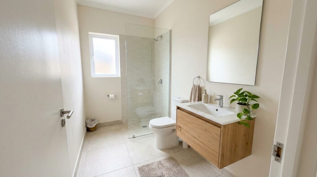
Small bathrooms require thoughtful scale and contrast rather than one specific color family. Light colors can reflect more available light and create a visually open background, but that does not guarantee a room will feel larger. A bathroom with pale walls and heavy visual clutter can still feel crowded. When choosing bathroom paint colors for a compact space, first simplify the palette. Using fewer competing colors across walls, tile, vanity, and accessories can create stronger visual continuity. Soft white, light greige, pale blue, muted green, and gentle beige are practical starting points when you want an airy look. For more personality, use a deeper vanity color while keeping the walls restrained. Another approach is to embrace the small dimensions with a rich wall color rather than trying to disguise them. Whatever direction you choose, avoid selecting paint without considering the mirror, lighting, shower curtain, floor pattern, and vanity. In a small room, each of these elements occupies a larger share of the visual field.
Choose Colors Differently for a Windowless Bathroom
A bathroom without a window does not receive changing natural daylight, so its artificial lighting becomes especially influential. Paint samples that looked perfect in another room may appear completely different here. Instead of automatically choosing bright white, test warm whites, gentle neutrals, pale greens, muted blues, and deeper shades under the actual fixtures. The best bathroom paint colors for a windowless room are those that look intentional under the lighting you use every day. Also evaluate the bulbs or integrated fixtures before blaming the wall color. Different light sources can alter how warm, cool, saturated, or muted a color appears. Paint several large sample areas on different walls because vertical surfaces can receive different amounts of light. Check the samples with the door both open and closed. A windowless bathroom also needs particular attention to moisture control. Paint cannot replace ventilation. EPA guidance emphasizes using bathroom exhaust ventilation or other appropriate moisture control to reduce humidity from showering.
Coordinate Paint With Bathroom Tile
Tile often occupies more visual space than homeowners realize, especially when it covers the shower and floor. The wall paint should therefore respond to the tile rather than compete with it. If the tile contains several colors, identify the quieter background or secondary tone and test related wall shades. For marble-look tile, inspect the veining carefully. Gray veining may lean blue, violet, green, or warm taupe. For patterned tile, simple bathroom paint colors often provide enough visual rest. If the tile itself is plain, the walls can carry more color. You do not need to pull an exact color directly from the tile. A related shade can create a more natural layered appearance. When tile is outdated but replacement is not currently practical, avoid trying to “cancel out” its undertone with an opposite wall color. That can make the mismatch more obvious. Instead, find a paint color that acknowledges the existing material and then modernize the room through lighting, textiles, hardware, or vanity color.
Match the Wall Color With the Vanity
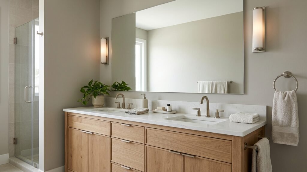
The vanity is often the largest furniture-like object in a bathroom, making its color important to the overall palette. White vanities provide flexibility, but even white cabinetry can lean warm or cool. Natural wood vanities usually pair well with warm whites, earthy greens, soft neutrals, and selected blues, depending on the wood tone. Dark vanities can create contrast against pale bathroom paint colors, while a dark-on-dark palette can produce a more dramatic look. If the vanity will also be painted, decide whether it should blend into the walls or become a focal point. A vanity painted slightly darker than the walls can create depth without a sharp contrast. A completely different color can work when another element in the room supports it. Do not evaluate the cabinet alone. Countertop color sits directly against it and can reveal incompatible undertones quickly. Sample wall and vanity colors beside the countertop together before purchasing full quantities of paint.
Think About Metal Finishes as Part of the Palette
Faucets, cabinet pulls, towel bars, shower frames, mirrors, and light fixtures contribute to the bathroom’s color story. Chrome and polished nickel can support crisp or cool schemes, while brass, bronze, and warmer metal finishes can add warmth. Black fixtures create strong contrast and can work with both warm and cool palettes. This does not mean your bathroom paint colors must match the metal finish. Instead, think about overall balance. A cool gray bathroom with several black elements may feel sharper than the same walls paired with warm wood and brass. Mixed metals can also work when the combination appears intentional. Repeating each important finish in more than one visible location often creates stronger visual continuity than introducing several unrelated finishes. Before changing paint because the room feels “off,” look at all the finishes together. Sometimes the wall color is not the real problem. An overly cool bulb, clashing vanity top, or isolated metal finish may be creating the disconnect.
The Right Paint Finish Matters in a Bathroom
Color and sheen should be chosen separately. A beautiful shade in an unsuitable coating can create maintenance problems. Satin and semi-gloss finishes are commonly considered for bathrooms because they provide greater moisture resistance and cleanability than many flatter finishes, although modern bathroom-suitable products can be available in several sheens. Sherwin-Williams, for example, identifies satin and semi-gloss as useful choices for moisture-exposed areas and also sells bathroom-suitable formulations in multiple sheen levels. When selecting paint for bathroom paint colors, read the exact product information rather than assuming every satin paint has identical performance. Higher sheen can make wall imperfections more noticeable because reflected light highlights texture. A quality bathroom-appropriate matte or lower-sheen formulation may therefore be worth considering when the manufacturer approves it for that environment. Ceilings also need suitable paint where shower humidity is significant. Follow the product’s preparation, application, recoat, and return-to-service instructions rather than relying on a universal drying rule.
Moisture Problems Need More Than Moisture-Resistant Paint
No wall color can fix a bathroom that remains damp for long periods. Showering adds substantial moisture to the room, and persistent humidity can contribute to condensation, mold growth, and coating problems. EPA guidance recommends controlling moisture, using bathroom ventilation, addressing leaks, and drying wet surfaces. Paint manufacturers likewise note that excessive moisture can contribute to peeling and that ventilation should be addressed before repainting damaged areas. Therefore, choosing mildew-resistant or bathroom-formulated paint does not eliminate the need to solve the underlying moisture source. Before changing bathroom paint colors, investigate peeling, bubbling, recurring mildew, damp drywall, ceiling stains, or persistent condensation. Repair leaks and damaged materials where needed. Existing mold or mildew should be handled appropriately rather than simply painted over. Once the room is dry and the cause is controlled, prepare and repaint the surface according to the coating manufacturer’s instructions.
Prepare Bathroom Walls Before Changing Color
Good preparation matters even when the existing paint appears mostly sound. Bathrooms collect soap residue, cosmetics, dust, hairspray, and other contaminants that can interfere with a clean finish. Begin by following the paint manufacturer’s cleaning and surface-preparation instructions. Remove loose or peeling material and repair damaged areas before painting. Glossy existing coatings may require preparation to achieve proper adhesion, depending on the new product. When changing bathroom paint colors dramatically, primer may be useful or required in some situations, such as repaired drywall, stained areas, bare surfaces, or difficult color transitions. Do not assume “paint and primer in one” means surface preparation is unnecessary. If there are water stains, determine why they appeared before covering them. Allow repaired surfaces and cleaning moisture to dry as required. Protect fixtures, floors, and tile carefully. Older painted surfaces can also raise lead-safety concerns when sanding or scraping, particularly in older buildings, so follow applicable safety guidance before disturbing unknown coatings.
Test Paint Samples Before Committing
Testing is one of the simplest ways to avoid an expensive color mistake. Small paper chips are useful for narrowing options but do not show how a shade behaves across a large wall. Test your shortlisted bathroom paint colors in the actual room. Use manufacturer sample products or another recommended sampling method and view the colors beside tile, countertops, cabinets, and trim. Check them in the morning, afternoon, and evening when the bathroom has natural light. In a windowless room, check the color under every lighting setting you normally use. Look at samples from the doorway and from inside the room. Also view them in the mirror because mirrors reflect large areas of wall color and can make a shade feel more dominant. Avoid testing dozens of nearly identical colors at once. Narrow the choice to a few serious candidates. Comparing too many shades can make subtle undertone differences harder, rather than easier, to judge.
Consider How Paint Color Affects the Mirror Area
The wall around a vanity affects how the entire bathroom feels because it appears repeatedly in the mirror. Strong greens, blues, reds, or other saturated shades can visually influence the reflected environment, especially when the color surrounds a large mirror. That does not mean strong bathroom paint colors should be avoided. It simply means you should view samples from the position where you get ready each day. Lighting quality matters even more around this area. If accurate appearance for grooming or makeup is important, prioritize useful vanity lighting instead of trying to solve every lighting issue through wall color. A dramatic color can work beautifully behind a mirror when the lighting is balanced and the countertop and vanity support it. Alternatively, keeping the vanity wall lighter while using deeper color elsewhere can provide contrast. There is no universal rule because mirror size, fixture placement, natural light, and room dimensions all change the result.
Use Two Colors Without Making the Bathroom Busy
A two-color bathroom can add depth without creating visual clutter. One approach is to use a quiet neutral across most walls and a deeper related shade on the vanity. Another is to use one wall color with contrasting trim or paneling. In rooms with architectural wall treatments, different colors can help define those features. The most successful bathroom paint colors usually have a clear hierarchy. Decide which shade is dominant and which is supporting it. Two equally strong colors competing with patterned flooring, decorative tile, and mixed metals can overwhelm a small room. When combining colors, compare their undertones and saturation. A muted sage may pair naturally with warm off-white, while deep navy can create stronger contrast against a clean neutral. Do not create an accent wall simply because the room seems to need one. Use a second color when it highlights architecture, balances another finish, or creates a deliberate focal point.
Powder Rooms Give You More Freedom With Color
A powder room can be an ideal place to experiment because it is usually smaller and does not contain a shower or bathtub. Without the same shower-generated moisture load, design decisions can focus more heavily on atmosphere, though normal paint suitability and ventilation still matter. Deep bathroom paint colors such as charcoal, forest green, navy, burgundy, chocolate brown, or saturated blue can make a small powder room feel intentional rather than merely tiny. Light colors remain equally valid when you want the room to feel simple and fresh. Because visitors often use powder rooms, this space can support a stronger design choice than the main bathroom. Consider the vanity, mirror, lighting, flooring, and wall color as one composition. A dark room may benefit from a reflective mirror and well-planned lighting. A bold wall color may need very little additional decoration. Small spaces often look more sophisticated when one strong idea is executed consistently.
Create a Calm Bathroom With a Limited Palette
A relaxing bathroom does not require pale blue walls. Calmness often comes from reducing visual competition. Choose one main wall color, one or two supporting materials, and a small number of finishes. Soft warm white, muted green, gentle blue-gray, beige, taupe, or restrained earthy shades can all support this approach. When using calm bathroom paint colors, repeat related tones through towels, rugs, or small accessories instead of adding many unrelated colors. Natural wood can add warmth without acting like another bright hue. Stone and ceramic surfaces can contribute texture while keeping the palette quiet. Avoid making every object exactly the same shade. Slight variation creates depth and prevents the room from feeling flat. If the bathroom already has patterned tile, treat that pattern as one of the main visual elements and keep other choices quieter. A controlled palette makes it easier for the eye to rest and allows good materials to receive more attention.
Common Bathroom Paint Color Mistakes
One of the biggest mistakes is choosing a color from a phone screen and buying several gallons without testing it. Screen settings, photography, surrounding colors, and real-world lighting can make digital color representations unreliable. Another mistake is ignoring fixed finishes. Trendy gray walls will not automatically improve a bathroom if they clash with the floor and countertop. Homeowners also sometimes assume that lighter bathroom paint colors always make small rooms larger or that dark colors must be avoided. Neither rule is absolute. Poor lighting, excessive contrast, and clutter can influence the room just as much. Another mistake is focusing only on color while ignoring paint formulation and moisture control. Painting over mildew, damp areas, or peeling coatings without solving the cause can lead to recurring problems. Finally, avoid selecting a color because it looked beautiful in someone else’s bathroom. Their natural light, tile, vanity, bulb temperature, room orientation, and finishes may be completely different from yours.
How to Build a Bathroom Color Palette Step by Step
Begin with the least flexible surface. In many bathrooms, that is the floor, shower tile, or countertop. Identify its dominant color and undertones. Next, evaluate the vanity and large plumbing fixtures. Choose several possible bathroom paint colors that relate naturally to those materials. Then consider the metal finishes and lighting. Reduce the list to a few shades and test them in the actual room. View the samples at different times and beside every major surface. Once the wall color is selected, decide whether the trim and ceiling should remain the existing color or change. Then choose towels, rugs, artwork, and accessories. This order prevents small decorative items from controlling expensive decisions. If the room feels unbalanced after painting, avoid immediately repainting. First check the lighting, textiles, mirror, and accessories. Sometimes a new rug or warmer light source is enough to connect the palette. Build the room around permanent materials first and easily replaceable objects last.
Frequently Asked Questions
What are the best bathroom paint colors?
There is no single best shade. Soft whites, warm neutrals, muted greens, gentle blues, earthy tones, and deeper colors can all work. The strongest choice is one that complements the tile, countertop, vanity, lighting, and overall mood you want.
What colors make a small bathroom look bigger?
Light colors can reflect more available light and may create a more open visual background. However, room size is also affected by contrast, clutter, lighting, mirror placement, and material changes. A coordinated darker palette can also work successfully in a small bathroom.
Are dark colors bad for bathrooms?
No. Dark blue, green, charcoal, brown, and other deep shades can create a sophisticated bathroom. They absorb more light than pale colors, so good lighting and thoughtful contrast become more important. Testing a large sample before painting is particularly useful.
Should the bathroom ceiling be the same color as the walls?
It can be, but it does not have to be. Matching walls and ceiling can create a continuous, enveloping look. A lighter ceiling can provide more contrast. Whatever color you choose, use a coating suitable for the ceiling’s bathroom conditions and follow the manufacturer’s directions.
What paint sheen is best for bathroom walls?
Satin and semi-gloss are commonly used because of their durability and moisture resistance. However, some modern bathroom-suitable paints are available in lower-sheen finishes as well. Check the exact product specifications rather than selecting sheen alone.
Can bathroom paint prevent mold?
Paint formulated to inhibit mildew growth on its film can be useful, but paint cannot correct leaks, persistent condensation, or inadequate ventilation. Moisture control remains essential. EPA guidance recommends reducing excess humidity and using bathroom ventilation to help control moisture.
Conclusion
Choosing bathroom paint colors becomes much easier when you stop searching for one universally perfect shade. Start with the permanent materials already in the room. Identify their undertones, evaluate the natural and artificial light, and decide how much contrast you want. Then test several serious color options directly beside the tile, vanity, countertop, and fixtures. Soft whites and warm neutrals offer flexibility, while blues and greens can introduce calm color. Dark shades can work beautifully even in compact bathrooms when lighting and contrast are handled carefully. Just as important, choose a paint product suited to the bathroom environment and address ventilation, leaks, peeling, or recurring moisture before repainting. Color can transform how the room looks, but good preparation and moisture control help protect the finished result. Build the palette around the bathroom you actually have rather than a photograph, and the final color is far more likely to feel intentional.